IPCC models versus actual temperatures
One of the dominant memes among climate deniers are that climate models are inaccurate. While true, particularly since 1998 (see Fyfe et al. 2013), that fact doesn't mean that global warming isn't happening or that global warming is due to a natural cycle and not CO2 as many deniers claim. For those leaps of logic to be true, the entire field of radiative physics, 152 years of experiments, and 40+ years of satellite observations would all have to be wrong. Nor does it mean that climate isn't as sensitive to changes in radiative forcing as multiple studies have shown it to be (i.e. Paleosens 2013). What it means is far more complex.
To illustrate this complexity, I compared IPCC AR5 climate models with surface temperatures (GISS). The AR5 models were run with four scenarios, labeled RCP 2.6, RCP 4.5, RCP 6.0, and RCP 8.5. Data for each scenario, along with global temperature data, AMO, PDO, etc. are available at Climate Explorer. The RCP scenarios span the range of possible temperature scenarios, from a < 2ºC rise by AD 2100 (RCP 2.6, assuming strong mitigation) up to 4ºC by AD 2100 (RCP 8.5, business as usual). One note: All trends reported in this article compensate for autocorrelation and are trend ± 1σ standard error.
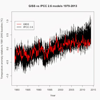
Comparing the RCP 2.6 model results with GISS temperature data (temperature anomalies relative to the 1981-2010 average) show that GISS temperatures have trended toward the bottom of the expected range over the past 10 years after being well within the expected range before.
This result holds true for the RCP 8.5 results as well.

In each case, actual global surface temperatures have trended toward the bottom of the predicted range—but still within the predicted range. However, it is quite a mismatch when the average of the models predicts a +0.2541 ± 0.02196ºC per decade rise in global surface temperature average (combined average of all 65 IPCC 2.6 models) between January 1998 and December 2012 whereas GISS surface temperatures show a +0.06192 ± 0.04637ºC per decade rise (January 1998 to October 2013). So what caused that mismatch between the multi-model average and actual surface temperatures? To understand that, we must first look at how models are constructed, tested, and then used.
The models were tested for their ability to predict twentieth century climate conditions given actual inputs such as solar output, ENSO, aerosols, and greenhouse gas levels (for an overview, see the excellent overview by the National Academy of Sciences). Those that can successfully replicate past climate are then used to predict conditions after AD 2000, predicting not only global temperature but the inputs (greenhouse gas emissions, ENSO, solar variation, aerosol concentrations, etc.) as well. If the models are overpredicting global temperatures, there are several sources of error to examine.
First, climate models treat changes in inputs such as changes in aerosols, a drop in solar output, changes in ENSO as random events. Random events get cancelled out when calculating a combined average of all models as I did to get the average rate of rise. So to really compare surface temperatures to the average of a series of climate models, you must first factor out those random events. Factoring out changes in ENSO, solar output, and aerosols (as per Foster and Rahmstorf 2011) showed that surface temperature rise January 1998 to March 2013 was +0.1498 ± 0.03151ºC per decade, still quite a bit lower than the IPCC RCP 2.6 average but far higher than the rate without factoring out those random factors. The adjusted GISS still trends toward the bottom of the expected range of the models, albeit not as low as the unadjusted data, indicating that while ENSO, solar output, and aerosol concentrations are part of the reason for the mismatch between modeled temperature rise and actual temperature rise, they're not the only reasons.

Second, expected changes in greenhouse gas emissions could be too high. This has been an issue for some time. In 2000, Dr. James Hansen noted that predicted changes in greenhouse gas emissions in IPCC models were off. His example was that the IPCC's methane concentration value was off by a factor of 3.
There is a third possibility that has been largely ignored. All of our surface temperature data sets underestimate the trues surface temperature of the Earth. Two of the data sets (HadCRUT4 and NCDC) do not cover the polar regions or much of Africa. With the Arctic the fastest warming region on Earth according to UAH satellite data, that is an omission that creates a cooling bias in those data sets.
GISS uses kriging to fill in the blanks on the map and therefore covers the entire globe. However, GISS still uses an out-dated ocean temperature data set (HadSST2) in their global data set. Over the past decade, the way ocean surface temperature is measured has changed from ship-based measurements to buoy-based measurements. The ship-based measurements are known to be warmer than the buoy-based measurements (Kennedy et al. 2011). HadSST2 doesn't account for that difference, creating an artificial cooling trend in ocean data over the past 10 years, which in turn creates an artificial cooling influence in GISS global data. HadCRUT4 uses the updated HadSST3 data set, which does account for that difference.
To correct for the coverage problem in HadCRUT4, Cowtan and Way (2013) recently used UAH satellite data to fill in the coverage gaps in HadCRUT4 data. Their method was to use kriging on the difference between surface and satellite data. Their new data set matches surface data where surface data exists. Where surface data does not, they used the interpolated differences to convert existing satellite data to surface data.
Filling in the gaps has a dramatic effect on the short-term trend. Before, the January 1998-December 2012 trend in HadCRUT4 data was +0.01976 ± 0.05555ºC per decade. After, the trend for the same time period is +0.10508 ± 0.05458ºC per decade.
Comparing the coverage-corrected HadCRUT4 to the IPCC models shows that while coverage made a noticeable difference, even the corrected HadCRUT4 trends toward the bottom of the IPCC range.

Adjusting the coverage-corrected HadCRUT4 to account for ENSO, aerosols, and solar output makes an even larger difference in the trend since 1998: +0.1880 ± 0.02765ºC per decade. That places surface temperatures well within the range of the IPCC models, with only temperatures in 2011 and 2012 trending toward the bottom of the IPCC range. And the rate of rise is much closer to the IPCC multi-model average of +0.2541ºC per decade.

These analyses that I've done indicate that ENSO, aerosols, and solar output combined with cooling biases in the surface temperature data are major reasons for the mismatch since 1998 between surface temperature data and IPCC models. However, they also indicate that those reasons are not the entire answer. The final piece of the puzzle comes from a recent paper by Kosaka and Xie (2013). They re-ran the IPCC AR5 models and found that the output of the models matched the slow-down in surface temperatures since 1998 when the models were given the actual values of ENSO, aerosols, solar ouput, and greenhouse gas concentrations. James Hansen's concern about overestimated increases in greenhouse gas concentrations from 2000 may still hold true today.
Looking at the full puzzle, then, the answer for why there is an apparent mismatch between IPCC models and surface temperatures since 1998 is 1) an inability in the models to accurately predict random changes in ENSO, aerosols, and solar output, 2) artificial cooling in the surface temperature data due to poor coverage and/or changes in how surface data is collected, and 3) overestimates of greenhouse gas concentrations. Does this mean that we shouldn't be worried about global warming because the models are wrong? No. All this hullabaloo over the climate models is really just arguing over how fast warming will occur over the next 100 years. Even our current climate sensitivity value (0.8ºC/W/m2) is for a 100-year window. However, warming won't magically stop in AD 2100. The effects of the warming that we created will be felt for centuries, with long-term feedbacks boosting climate sensitivity to ~1.6ºC/W/m2. For instance, the last time CO2 levels were as high as today's levels was the mid-Miocene. Global temperatures were ~3ºC warmer than today and sea levels 25 meters higher (Tripati et al. 2009). That is where we're headed with global warming—and we'll likely warm even further, as that is the prediction for today's greenhouse gas levels and we're adding over 2 ppmv to that each year. The consequences of that much warming will be devastating on agriculture and the ability of humans to live in many regions of the planet. Sea levels will continue to rise for at least another 2,000 years (Levermann et al. 2013), making many coastal areas uninhabitable. One of the few studies to even consider warming past AD 2100 found that most of the planet could become uninhabitable due to heat stress by AD 2300 (Sherwood and Huber 2010), particularly on a business-as-usual emissions path.
Sorry to get all gloom-and-doom, but the reality is that if we don't get our act together and soon, we have basically doomed future generations to living on a planet that will be very hostile to human life. And I care too much about my children and their future to allow that to happen without raising a ruckus about it.
To illustrate this complexity, I compared IPCC AR5 climate models with surface temperatures (GISS). The AR5 models were run with four scenarios, labeled RCP 2.6, RCP 4.5, RCP 6.0, and RCP 8.5. Data for each scenario, along with global temperature data, AMO, PDO, etc. are available at Climate Explorer. The RCP scenarios span the range of possible temperature scenarios, from a < 2ºC rise by AD 2100 (RCP 2.6, assuming strong mitigation) up to 4ºC by AD 2100 (RCP 8.5, business as usual). One note: All trends reported in this article compensate for autocorrelation and are trend ± 1σ standard error.
Comparing the RCP 2.6 model results with GISS temperature data (temperature anomalies relative to the 1981-2010 average) show that GISS temperatures have trended toward the bottom of the expected range over the past 10 years after being well within the expected range before.

This result holds true for the RCP 8.5 results as well.

In each case, actual global surface temperatures have trended toward the bottom of the predicted range—but still within the predicted range. However, it is quite a mismatch when the average of the models predicts a +0.2541 ± 0.02196ºC per decade rise in global surface temperature average (combined average of all 65 IPCC 2.6 models) between January 1998 and December 2012 whereas GISS surface temperatures show a +0.06192 ± 0.04637ºC per decade rise (January 1998 to October 2013). So what caused that mismatch between the multi-model average and actual surface temperatures? To understand that, we must first look at how models are constructed, tested, and then used.
The models were tested for their ability to predict twentieth century climate conditions given actual inputs such as solar output, ENSO, aerosols, and greenhouse gas levels (for an overview, see the excellent overview by the National Academy of Sciences). Those that can successfully replicate past climate are then used to predict conditions after AD 2000, predicting not only global temperature but the inputs (greenhouse gas emissions, ENSO, solar variation, aerosol concentrations, etc.) as well. If the models are overpredicting global temperatures, there are several sources of error to examine.
First, climate models treat changes in inputs such as changes in aerosols, a drop in solar output, changes in ENSO as random events. Random events get cancelled out when calculating a combined average of all models as I did to get the average rate of rise. So to really compare surface temperatures to the average of a series of climate models, you must first factor out those random events. Factoring out changes in ENSO, solar output, and aerosols (as per Foster and Rahmstorf 2011) showed that surface temperature rise January 1998 to March 2013 was +0.1498 ± 0.03151ºC per decade, still quite a bit lower than the IPCC RCP 2.6 average but far higher than the rate without factoring out those random factors. The adjusted GISS still trends toward the bottom of the expected range of the models, albeit not as low as the unadjusted data, indicating that while ENSO, solar output, and aerosol concentrations are part of the reason for the mismatch between modeled temperature rise and actual temperature rise, they're not the only reasons.

Second, expected changes in greenhouse gas emissions could be too high. This has been an issue for some time. In 2000, Dr. James Hansen noted that predicted changes in greenhouse gas emissions in IPCC models were off. His example was that the IPCC's methane concentration value was off by a factor of 3.
There is a third possibility that has been largely ignored. All of our surface temperature data sets underestimate the trues surface temperature of the Earth. Two of the data sets (HadCRUT4 and NCDC) do not cover the polar regions or much of Africa. With the Arctic the fastest warming region on Earth according to UAH satellite data, that is an omission that creates a cooling bias in those data sets.
 |
| HadCRUT4 coverage map. The areas in white are not included in the data. |
To correct for the coverage problem in HadCRUT4, Cowtan and Way (2013) recently used UAH satellite data to fill in the coverage gaps in HadCRUT4 data. Their method was to use kriging on the difference between surface and satellite data. Their new data set matches surface data where surface data exists. Where surface data does not, they used the interpolated differences to convert existing satellite data to surface data.
Filling in the gaps has a dramatic effect on the short-term trend. Before, the January 1998-December 2012 trend in HadCRUT4 data was +0.01976 ± 0.05555ºC per decade. After, the trend for the same time period is +0.10508 ± 0.05458ºC per decade.
 |
| From http://www-users.york.ac.uk/~kdc3/papers/coverage2013/background.html |

Adjusting the coverage-corrected HadCRUT4 to account for ENSO, aerosols, and solar output makes an even larger difference in the trend since 1998: +0.1880 ± 0.02765ºC per decade. That places surface temperatures well within the range of the IPCC models, with only temperatures in 2011 and 2012 trending toward the bottom of the IPCC range. And the rate of rise is much closer to the IPCC multi-model average of +0.2541ºC per decade.

These analyses that I've done indicate that ENSO, aerosols, and solar output combined with cooling biases in the surface temperature data are major reasons for the mismatch since 1998 between surface temperature data and IPCC models. However, they also indicate that those reasons are not the entire answer. The final piece of the puzzle comes from a recent paper by Kosaka and Xie (2013). They re-ran the IPCC AR5 models and found that the output of the models matched the slow-down in surface temperatures since 1998 when the models were given the actual values of ENSO, aerosols, solar ouput, and greenhouse gas concentrations. James Hansen's concern about overestimated increases in greenhouse gas concentrations from 2000 may still hold true today.
Looking at the full puzzle, then, the answer for why there is an apparent mismatch between IPCC models and surface temperatures since 1998 is 1) an inability in the models to accurately predict random changes in ENSO, aerosols, and solar output, 2) artificial cooling in the surface temperature data due to poor coverage and/or changes in how surface data is collected, and 3) overestimates of greenhouse gas concentrations. Does this mean that we shouldn't be worried about global warming because the models are wrong? No. All this hullabaloo over the climate models is really just arguing over how fast warming will occur over the next 100 years. Even our current climate sensitivity value (0.8ºC/W/m2) is for a 100-year window. However, warming won't magically stop in AD 2100. The effects of the warming that we created will be felt for centuries, with long-term feedbacks boosting climate sensitivity to ~1.6ºC/W/m2. For instance, the last time CO2 levels were as high as today's levels was the mid-Miocene. Global temperatures were ~3ºC warmer than today and sea levels 25 meters higher (Tripati et al. 2009). That is where we're headed with global warming—and we'll likely warm even further, as that is the prediction for today's greenhouse gas levels and we're adding over 2 ppmv to that each year. The consequences of that much warming will be devastating on agriculture and the ability of humans to live in many regions of the planet. Sea levels will continue to rise for at least another 2,000 years (Levermann et al. 2013), making many coastal areas uninhabitable. One of the few studies to even consider warming past AD 2100 found that most of the planet could become uninhabitable due to heat stress by AD 2300 (Sherwood and Huber 2010), particularly on a business-as-usual emissions path.
Sorry to get all gloom-and-doom, but the reality is that if we don't get our act together and soon, we have basically doomed future generations to living on a planet that will be very hostile to human life. And I care too much about my children and their future to allow that to happen without raising a ruckus about it.


Hey, there is a broken link in this article, under the anchor text - fyfe et al. 2013
ReplyDeleteHere is the working link so you can replace it - https://selectra.co.uk/sites/selectra.co.uk/files/pdf/over-estimated-global-warming.pdf
Fixed. Thank you.
Delete