Shifting Bell Curves revisited
It's been a few years (close to four) since I last wrote a post. Yes, I'm still alive. Life just...got complicated for a bit.
While much has been happening, it seems that outright climate change denial is finally dying, probably because we're already seeing it happen before our very eyes. In this post, I'm revisiting the Shifting Bell Curves I first wrote about in 2013. Here we go.
One of the tenants of climate change is that it changes the frequency and probability of climate-related events. Here I use NCDC data broken into decades to show how the frequency of monthly global mean temperatures changed over time.
We're all familiar with time series plots of temperature data such as the one below showing that global mean temperatures have risen by an average of 0.179ºC per decade (95% confidence interval: 0.171 to 0.188ºC) since 1970.
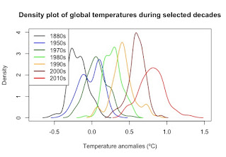
However, this way, while still informative, doesn't allow the reader to really grasp just how much the distribution of monthly mean temperatures shifted over time. For that, I turn to density graphs of monthly mean temperatures by decade. Here's one example:
These graphs should look familiar—they're essentially real-life bell curves. You can easily see how the distribution of monthly mean temperatures steadily shifted to the right since 1970. The coldest months of the 2010s would have been the warmest months in the 1970s. It's not just that the distribution has changed. So has the probability of temperatures. Let's do an example.
The mean temperature of the 2010s was 0.79725ºC. Back in the 1970s, the probability of getting a global mean temperature that high was 0.0019895%. But by the 2010s, that temperature was the mean, with a probability of 50%. That's an increase of 2,513,131% in probability in just 40 years. What would have been unheard-of heat in the 1970s is now the norm.
That, honestly, is the actual signature of climate change. Changing global temperatures change the distribution of temperatures, making some temperatures more likely and others less likely. Unfortunately, it takes place slowly, over decades. By the time we see it with our own eyes, we're dealing with climate changed, not just the potential of climate change. Even then, we're likely to downplay our perception of how much our world has already changed thanks to the phenomenon of shifting baselines (Klein and Thurstan 2016).
If you're interested in the R code I used, you can find it on my RPubs page where I wrote a draft of this post with R code embedded within.
Literature Cited
Klein and Thurstan, 2016. Acknowledging Long-Term Ecological Change: The Problem of Shifting Baselines. pp 11-29 in Máñez and Poulsen, editors. Perspectives on Oceans Past: A Handbook of Marine Environmental History. Springer, London, UK URL: http://ndl.ethernet.edu.et/bitstream/123456789/77671/1/Kathleen%20Schwerdtner%20M%C3%A1%C3%B1ez.pdf#page=24


Really interesting breakdown of digital identity and interaction! It’s crucial to reflect on how we present ourselves online.
ReplyDeletehttps://blogs.ubc.ca/marcusfeldthus/2014/09/18/the-digital-people-who-are-we-dealing-with/#comment-1711