What is the deal with RSS?
It's nice when a topic for a new post lands in your lap. Or, in this case, in the comments of one of your old posts. An anonymous commentator made several statements concerning RSS that warrant a longer explanation than is possible in a reply on the comment section. This is going to be a long, stats-heavy post. You've been warned.
First, let's compare UAH and RSS satellite temperature records. For this, I set both to a 1981-2010 baseline.
While the differences between UAH and RSS are generally small, there are some very interesting patterns. RSS was consistently higher than UAH from 1992 to 2001. Since 2004, however, UAH has been consistently higher, with the difference between the two growing larger since 2010. The reason(s) behind the switch in which data set is higher and the growing difference between the two have, to my knowledge, not been positively identified. Roy Spencer believes that increasing levels of diurnal drift are to blame, claiming that the satellites the RSS team uses are old and are unable to maintain stable orbits whereas the UAH team switched to newer satellites that can maintain stable orbits. However, I haven't read or heard of any published papers that reached that conclusion.
One other possibility is the differences in coverage. UAH covers the planet from 85ºN latitude to 85ºS latitude. RSS covers from 82.5ºN to 70ºS, a much smaller portion of the globe, particularly in the Southern Hemisphere. Whatever is behind that pattern, be it increasing levels of diurnal drift, the differences in global coverage, a difference in the algorithms that turn satellite measurements into temperature, or some other factor, it is likely a systemic bias of some sort in one or both of the data sets. It's definitely not just a random difference.
There is a major problem with claiming that there has been no global warming since 1996 or 1998, or whatever year you want to start on: There is no evidence that shows that warming has stopped or that the trend has even changed. I can hear you say, "B...b...but the trend isn't statistically significant since (fill in the blank)!" True. But that doesn't mean the trend doesn't exist. It simply means that the trend we see could be due to chance. Stefan Rahmstorf has an excellent article on Real Climate on this subject. I highly recommend reading it.
Here's what I mean by "no evidence." Examining the trend using different start years, the thing that stands out is the size of the 95% confidence intervals around the calculated trends.
Notice how the confidence intervals grow larger as the start year gets closer to the present day? That's expected because you're using less data. Also note how the confidence interval, regardless of start year, overlap those of the trends from other start years. That means that there is no statistical difference between the trends, regardless of start point. Going strictly from the data, there is no way you can say that the warming trend seen in the larger data set has stopped or even slowed. The best you can say is that the observed trend since (fill in your favorite cherry-picked start year) is due to random chance.
Also note how the UAH and RSS trends have the same overall pattern, rising from 1990 to 1992, dropping from 1993 to 1998 as the start year gets closer to 1998, then rebounding past 1998. The difference between them? The trends are offset by an average of 0.0090ºC/year (range: 0.0054 to 0.0118). That's a sizable difference and that difference has grown over time.

Why is this? Look back at the graph comparing UAH and RSS. Note how RSS is generally higher than UAH in the 1990s but lower in the 2000s? That would tend to flatten the RSS trend relative to the UAH trend, with that flattening increasing as the time period gets shorter.
There's also the effect of starting a trend close to 1998. Global temperatures spiked in 1998 due to the largest El Niño event on record. As a result, 1998 is an extreme outlier. How extreme? Look at the residuals. Residuals are what's left over after the overall trend is removed. Residual graphs of temperature time series show us how far above or below the overall trend any one year was. Here are the residual graphs for UAH and RSS:
Note those huge spikes 19 years after 1979? That's 1998, showing just how extremely hot 1998 was above and beyond the overall trend. What does that huge outlier do to a trend if you start the trend close to it? Take a look:
As you get closer the extreme outlier, it "pulls" the left end of the trendline up. That flattens out the trend, making it appear that warming has slowed or even reversed. It hasn't. It's just the effect of a) starting your trend so close to an extreme outlier and b) using a small subset of data instead of the full data set. It also appears that 2011, 2012, and 2013, the years where RSS and UAH temperature measurements disagree the most, exert a very strong influence on the RSS trend as the time period gets shorter.
Short answer: No. Let's use an analogy. If you're measuring a board and two different tape measures give you two different answers, how do you resolve the dispute? Do you assume that you don't know anything about measuring wood? Or do you go find a third measuring tape to see which one of your original two are wrong?
The basics of the climate system were worked out in the 1800s and are well understood. If you want a primer on those basics, see the Basics of Global Warming page. The theory of anthropogenic climate change itself dates back to 1896 (Arrhenius 1896). Rather than throw what we know and understand out the window just because UAH and RSS disagree, we go looking for a third measuring tape to see which is correct.
In this case, we have surface temperature measurements to provide a check on satellite trends. Yes, technically, surface thermometers and satellites don't measure the same thing. Surface thermometers measure the temperature of the air 2 meters above the surface, satellites measure the temperature 1,000 meters above the surface. However, the trends should still be in reasonable agreement with each other, despite the very different methods of collecting and compiling the data.

The graph above may be somewhat busy, but what it shows is that the trends calculated from GISS and UAH agree quite closely whereas the trends calculated from RSS are well below either UAH or GISS. GISS isn't the only surface data set that displays close agreement with UAH, either. Trends from coverage-corrected HadCRUT4 and the Berkeley Earth land + ocean temperature data are even more similar to the UAH trends.


This is strong evidence that the trends calculated from UAH data are correct whereas those calculated from RSS data are too low. If you're going to hang your entire worldview about global warming on the RSS trend (à la Lord Monckton), you're depending on a very thin thread of support.
I've already discussed this topic here. You can find many others who have written about it (i.e. Carl Mears' post on Sept. 22, 2014). Mears, by the way, is one of the lead RSS analysts.
I've been thinking quite a bit about that particular post. I've been meaning to rewrite it, as the criteria I used to define an El Niño year and a La Niña year (annual average MEI score ≥ 0.5 or ≤ -0.5) is, to be blunt, too stringent. That places only the absolutely strongest ENSO events in either category, dropping all medium and weak ENSO events (e.g. the 2005 and 2010 El Niños) in the neutral category. In short, my analysis did not correctly categorize ENSO events simply because the bar was set too high. That, in turn, would throw the results off.
Hope this helps. Until next time.
First, let's compare UAH and RSS satellite temperature records. For this, I set both to a 1981-2010 baseline.
 |
| Figure 1. Direct comparison between UAH global satellite temperature and RSS global satellite temperature. Anomalies calculated from the 1981-2010 baseline period. |
While the differences between UAH and RSS are generally small, there are some very interesting patterns. RSS was consistently higher than UAH from 1992 to 2001. Since 2004, however, UAH has been consistently higher, with the difference between the two growing larger since 2010. The reason(s) behind the switch in which data set is higher and the growing difference between the two have, to my knowledge, not been positively identified. Roy Spencer believes that increasing levels of diurnal drift are to blame, claiming that the satellites the RSS team uses are old and are unable to maintain stable orbits whereas the UAH team switched to newer satellites that can maintain stable orbits. However, I haven't read or heard of any published papers that reached that conclusion.
One other possibility is the differences in coverage. UAH covers the planet from 85ºN latitude to 85ºS latitude. RSS covers from 82.5ºN to 70ºS, a much smaller portion of the globe, particularly in the Southern Hemisphere. Whatever is behind that pattern, be it increasing levels of diurnal drift, the differences in global coverage, a difference in the algorithms that turn satellite measurements into temperature, or some other factor, it is likely a systemic bias of some sort in one or both of the data sets. It's definitely not just a random difference.
No warming since???
There is a major problem with claiming that there has been no global warming since 1996 or 1998, or whatever year you want to start on: There is no evidence that shows that warming has stopped or that the trend has even changed. I can hear you say, "B...b...but the trend isn't statistically significant since (fill in the blank)!" True. But that doesn't mean the trend doesn't exist. It simply means that the trend we see could be due to chance. Stefan Rahmstorf has an excellent article on Real Climate on this subject. I highly recommend reading it.
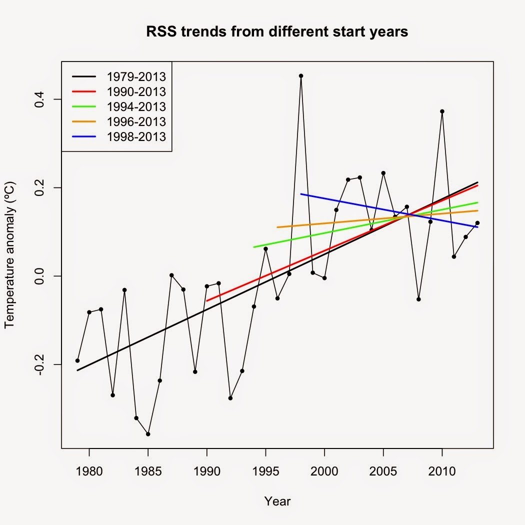
Here's what I mean by "no evidence." Examining the trend using different start years, the thing that stands out is the size of the 95% confidence intervals around the calculated trends.
 |
 |
Notice how the confidence intervals grow larger as the start year gets closer to the present day? That's expected because you're using less data. Also note how the confidence interval, regardless of start year, overlap those of the trends from other start years. That means that there is no statistical difference between the trends, regardless of start point. Going strictly from the data, there is no way you can say that the warming trend seen in the larger data set has stopped or even slowed. The best you can say is that the observed trend since (fill in your favorite cherry-picked start year) is due to random chance.
Also note how the UAH and RSS trends have the same overall pattern, rising from 1990 to 1992, dropping from 1993 to 1998 as the start year gets closer to 1998, then rebounding past 1998. The difference between them? The trends are offset by an average of 0.0090ºC/year (range: 0.0054 to 0.0118). That's a sizable difference and that difference has grown over time.
Why is this? Look back at the graph comparing UAH and RSS. Note how RSS is generally higher than UAH in the 1990s but lower in the 2000s? That would tend to flatten the RSS trend relative to the UAH trend, with that flattening increasing as the time period gets shorter.
There's also the effect of starting a trend close to 1998. Global temperatures spiked in 1998 due to the largest El Niño event on record. As a result, 1998 is an extreme outlier. How extreme? Look at the residuals. Residuals are what's left over after the overall trend is removed. Residual graphs of temperature time series show us how far above or below the overall trend any one year was. Here are the residual graphs for UAH and RSS:
 |
 |
Note those huge spikes 19 years after 1979? That's 1998, showing just how extremely hot 1998 was above and beyond the overall trend. What does that huge outlier do to a trend if you start the trend close to it? Take a look:
 |
 |
As you get closer the extreme outlier, it "pulls" the left end of the trendline up. That flattens out the trend, making it appear that warming has slowed or even reversed. It hasn't. It's just the effect of a) starting your trend so close to an extreme outlier and b) using a small subset of data instead of the full data set. It also appears that 2011, 2012, and 2013, the years where RSS and UAH temperature measurements disagree the most, exert a very strong influence on the RSS trend as the time period gets shorter.
Doesn't the fact that UAH and RSS disagree mean we don't understand climate?
Short answer: No. Let's use an analogy. If you're measuring a board and two different tape measures give you two different answers, how do you resolve the dispute? Do you assume that you don't know anything about measuring wood? Or do you go find a third measuring tape to see which one of your original two are wrong?
The basics of the climate system were worked out in the 1800s and are well understood. If you want a primer on those basics, see the Basics of Global Warming page. The theory of anthropogenic climate change itself dates back to 1896 (Arrhenius 1896). Rather than throw what we know and understand out the window just because UAH and RSS disagree, we go looking for a third measuring tape to see which is correct.
In this case, we have surface temperature measurements to provide a check on satellite trends. Yes, technically, surface thermometers and satellites don't measure the same thing. Surface thermometers measure the temperature of the air 2 meters above the surface, satellites measure the temperature 1,000 meters above the surface. However, the trends should still be in reasonable agreement with each other, despite the very different methods of collecting and compiling the data.
The graph above may be somewhat busy, but what it shows is that the trends calculated from GISS and UAH agree quite closely whereas the trends calculated from RSS are well below either UAH or GISS. GISS isn't the only surface data set that displays close agreement with UAH, either. Trends from coverage-corrected HadCRUT4 and the Berkeley Earth land + ocean temperature data are even more similar to the UAH trends.
This is strong evidence that the trends calculated from UAH data are correct whereas those calculated from RSS data are too low. If you're going to hang your entire worldview about global warming on the RSS trend (à la Lord Monckton), you're depending on a very thin thread of support.
What about the disparity between observed temperatures and climate models over the past x years?
I've already discussed this topic here. You can find many others who have written about it (i.e. Carl Mears' post on Sept. 22, 2014). Mears, by the way, is one of the lead RSS analysts.
What about your analysis showing that ENSO neutral years had the fastest rate of rise?
I've been thinking quite a bit about that particular post. I've been meaning to rewrite it, as the criteria I used to define an El Niño year and a La Niña year (annual average MEI score ≥ 0.5 or ≤ -0.5) is, to be blunt, too stringent. That places only the absolutely strongest ENSO events in either category, dropping all medium and weak ENSO events (e.g. the 2005 and 2010 El Niños) in the neutral category. In short, my analysis did not correctly categorize ENSO events simply because the bar was set too high. That, in turn, would throw the results off.
Hope this helps. Until next time.


I would like to thank you for the efforts you have made in writing this article. I am hoping the same best work from you in the future as well. In fact your creative writing abilities has inspired me to start my own BlogEngine blog now. Really the blogging is spreading its wings rapidly. Your write up is a fine example of it.
ReplyDeletetop cyber monday deals 2014