Posts

Showing posts from August, 2014

The Daily Fail: David Rose's newest cherry-pick.
Image
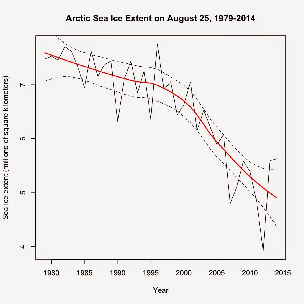
David Rose, who is no stranger to cherry-picking climate data and then weaving artful tales based on those cherry-picks, is back with yet another example of his perversity .  This time, he's trumpeting a 2-year increase in Arctic sea ice as measured on a single day: August 25, 2012 vs. August 25, 2014, claiming a 43% increase based on those two very specific days.  This is misleading for multiple reasons, one of which he himself admits in small type under that large flashy graphic at the top of his article: " These reveal that – while the long-term trend still shows a decline – last Monday, August 25, the area of the Arctic Ocean with at least 15 per cent ice cover was 5.62 million square kilometres." (emphasis added). So, just what does that long-term trend show? This:

So what if CO2 was 2400 ppmv in the Mesozoic

This is a response to those who try to claim that global warming won't be so bad.  The gist of their argument is that since life thrived in the Mesozoic when CO 2 was ~2400 ppmv and temperatures 8ºC warmer, climate change today isn't anything to be worried about.  Unfortunately, this argument ignores some very basic facts about biology and physics.  Here is some of what they're ignoring. 1) First, thanks to those individuals for accidentally confirming the relationship between CO 2 and global temperature, as well as modern estimates of climate sensitivity.  At modern solar radiation levels and with climate sensitivity at 0.809 W/m 2 , the equilibrium climate model predicts that with CO 2 at 2400 ppmv, global temperatures would rise by 9.3ºC above pre-industrial temperatures.  Factor in a weaker sun back in the Mesozoic and you get the 8ºC rise experienced from 2400 ppmv CO 2 back then ( Royer 2006 ).  Got to love it when those who dismiss science score an own goal and

Roy Spencer and 95% of models are wrong

Image
Claims that 95% of climate models are wrong have been making the rounds since Spencer published it on his blog in February.  Here's the graph he created: Take a good look.  Not only does his graph appear to show that most models are higher than both HadCRUT4 and UAH satellite temperature record but it shows that HadCRUT4 is higher than UAH as well.  That is...strange, to say the least.  IPCC AR5 (aka CMIP5) models were calibrated against 20th century temperatures (1900-1999) and have only been actually predicting temperatures since 2000.  However, Spencer's graph appears to show that their output is higher than the observed temperature records for 1983-1999—during the calibration period.  That makes no sense at all.

More predictions of September Arctic sea ice extent

Image
I published a prediction of Arctic sea ice extent on July 1 that was based on September sea ice extent from 1979 to 2013.  That model yielded a prediction that the average extent for September 2014 would be 4.135 million square kilometers.  However, that model does not take into consideration any other information we have on Arctic sea ice, such as the ice extent in previous months of the year.  It just gives the general trend of sea ice in September from year to year.  You cannot use it to predict ice extent based on current ice extent or conditions.

Where does 2014 rank in the hottest years on record so far?

Image
While we're closing in on September, several of the global temperature datasets are still stuck on June and haven't released the July data yet.  Just for fun, let's compare how the first six months of 2014 stack up to previous years.  To answer the question in the title, I  averaged the first six months of each year in the Cowtan-Way global temperature dataset.

IPCC models versus actual trends

Image
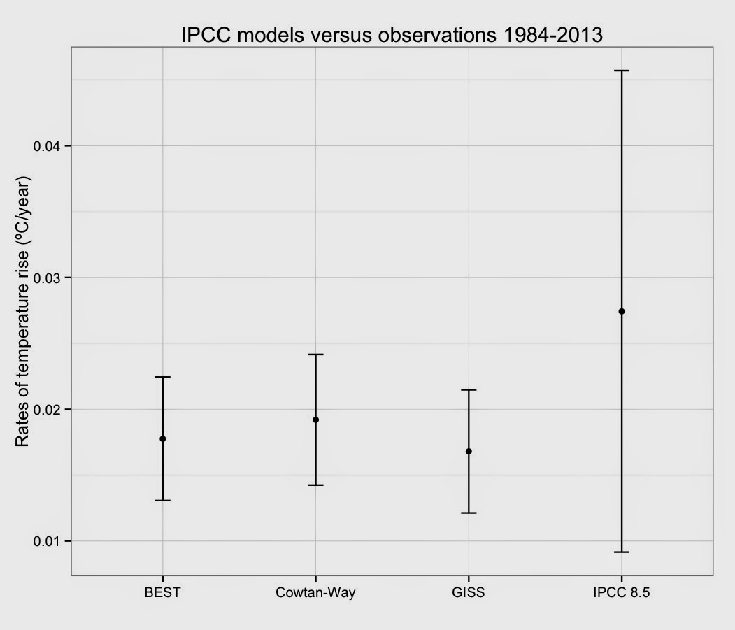
This is an extension of my previous post comparing IPCC models and actual temperature data .  I had a request to directly compare the observed rates of temperature rise with the predicted rise from the average of the AR5 models.  First, my methods:  I averaged all 81 IPCC AR5 8.5 models.  I then calculated the rate of change for the average of the models as well as Berkeley Earth's Land + Ocean dataset, the new Cowtan-Way coverage-corrected version of HadCRUT4, and GISS.  All rates were calculated after compensating for autocorrelation.  With that out of the way, here's the rates of temperature rise for the last 30 full years (1984-2013) in three surface datasets that cover the entire globe versus the average of all 81 IPCC AR5 8.5 scenarios: