Posts

Showing posts from 2014

Extinction is forever

Image
Here's a study I missed when it first came out two weeks ago: Monastersky, R. 2014. Biodiversity: Life—a status report. Nature 516:159-161 . This report compiled all known data on species status.  The results are sobering.  Thousands of species are at risk of extinction, including: 41% of all known amphibians 26% of all known mammals 13% of all known birds Note: Those are the species currently at risk.  Today.  Not predicted to be at risk in the future.  Forty-one percent of all amphibians, 26% of all mammals, and 13% of all birds are already at risk of extinction today .  And those are the best known groups. The rest—insects, plants, fungi, fish, etc?  Unknown, as not enough species in those groups have been evaluated to even guess at the percentage currently at risk of extinction.
The non-existant pause in global temperatures

Image
Regular readers of this blog will know that I am skeptical of claims that global warming in atmospheric temperatures have paused since 1998, having written several posts questioning the existence of such a pause.  In this edition, I'll run down the main evidence that, in my opinion, show that the pause is a figment of the denialsphere's imagination.

What is the deal with RSS?

Image
It's nice when a topic for a new post lands in your lap.  Or, in this case, in the comments of one of your old posts.  An anonymous commentator made several statements concerning RSS that warrant a longer explanation than is possible in a reply on the comment section.  This is going to be a long, stats-heavy post.  You've been warned.

Where 2014 would rank if global temperature reverted to the 1979-2013 trend

Image
Given that 2014 is nearly over (~3 weeks to go), we're going to be hearing even more about the possibility that 2014 will be the warmest year in the instrumental record.  I myself made the pile higher and deeper with my last post .  That raised a question in my mind: Where should global temperature be in 2014 according to the warming trend since 1979 (the first full year of the satellite record)?

Hottest years-to-date on record

Image
Back in August, I wrote a post that found the January-June period was the third hottest on record ( based on the Cowtan-Way data set which corrects the coverage bias in HadCRUT4 data).  This post will revise and update that earlier article, incorporating GISS, UAH, NCDC, HadCRUT4, and Cowtan-Way data sets.  I am not including RSS, as that data set has shown false cooling since 2000.

Tom Luongo's multiple lies about climate change

Image
An old friend posted an " article " by Tom Luongo, a former chemist (B.S. from the University of Florida) who now writes the Resolute Wealth Newsletter, on Facebook.  Unfortunately, that article is chock full of lies about climate science.  Since Facebook comments aren't the best forum for debunking Gish Gallops, I'm taking the liberty of debunking them here. [Update: Since Luongo got most of his claims from John Casey, I've written something about his brand of science here .]

Musings after the US election

For anyone paying attention, the US election yesterday was a disaster for Democrats.  That party lost control of the US Senate (likely 53-47) and took a drubbing in US House races (242-174) and US governors' (24-8) races.  The end result as far as science, environmental policy, and climate change is that science deniers now control key oversight committees on science, as many news organizations have noted.  The likely result for at least the next two years is unending investigations, waste-of-time hearings, and other obstacles erected to make environmental regulators' working lives a living hell.  Forget about the US ratifying any environmental treaties, much less anything having to do with climate change.  On the state level, I expect rollbacks of renewable energy mandates at the least, along with attempts to repeal other environmental regulations and meaningless resolutions attempting to nullify various federal laws and/or appropriate federal lands for state a...

Trend versus cycles in global temperature data

Image
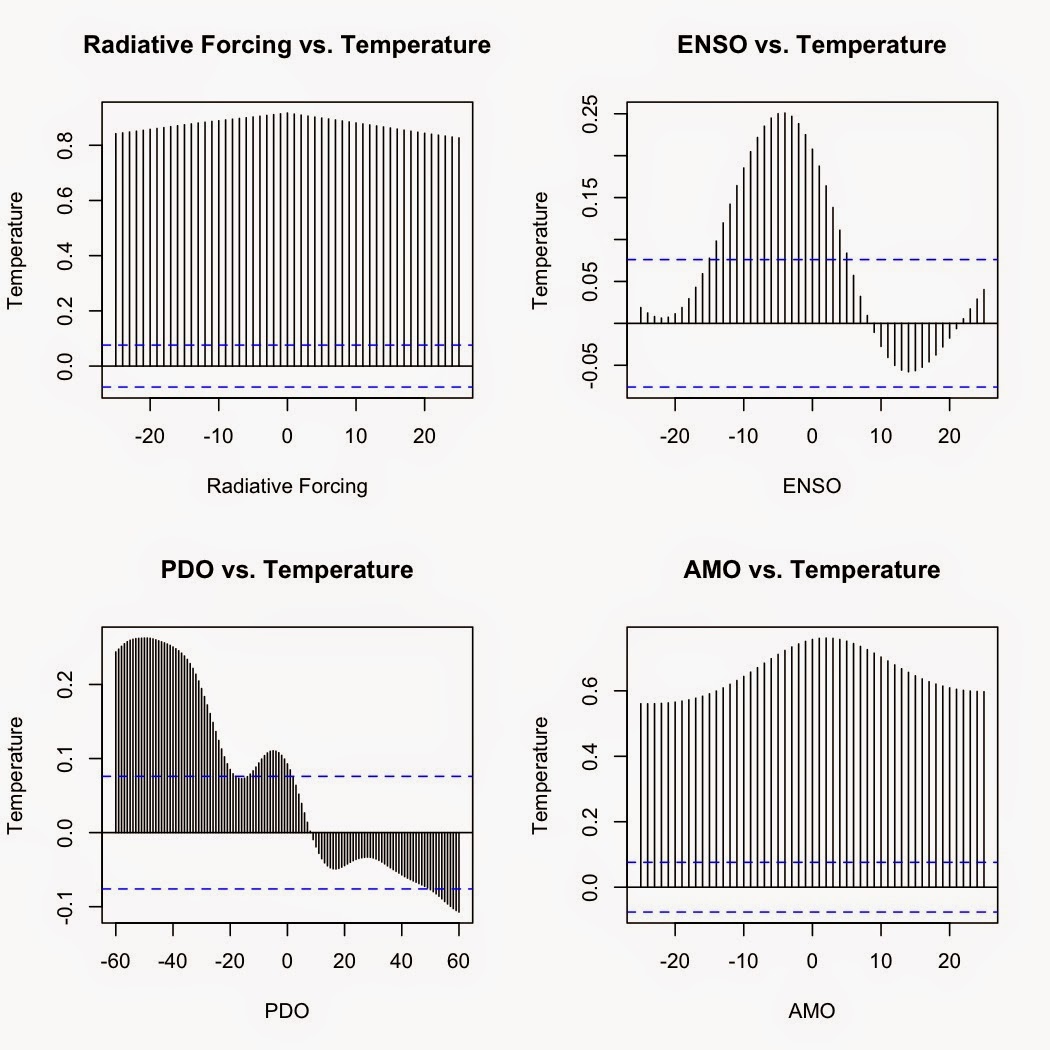
One of the most useful features about models, both statistical and physical, is that you can examine different aspects of the system you are analyzing separate from all other other influences.  Want to see if El Niño/Southern Oscillation could be driving the trend in global temperatures?  Construct a realistic model, then isolate the ENSO term.  Want to see if a combination of natural cycles explains the trend?  Isolate the terms for the natural cycles from those for greenhouse gases, and examine the results.

Global warming: Carbon dioxide vs. Natural cycles

Image
The recent paper by Johnstone and Mantua ( 2014 ) has certainly made the rounds in conservative circles.  It's popped up several times on my Facebook feed as various friends and acquaintances share articles about it.  Unfortunately, most of those articles get it wrong, usually twisting Johnstone and Mantua's findings to imply that 80% of ALL global warming is natural.  As I explained in my last post , that is a blatant misinterpretation of their paper, which only applies to the northeastern Pacific and coastal regions of the US Pacific Northwest.  Globally, natural cycles do not explain the trend in global temperatures.  How can I say that?  Do the statistics.

Temperature trends and natural variation in the Pacific Northwest

Image
A recent study by Johnstone and Mantua ( 2014 ) found a high correlation (r = 0.78) between sea surface temperatures since 1900 and changes in atmospheric pressure over the Northeastern Pacific, claiming that 80% of the variance in sea surface temperatures in the Northeastern Pacific was explained by changes in the North Pacific high.

Seeing how well predictions for September Arctic sea ice did in 2014

Image
In August, I published a post listing predictions of what the average September sea ice extent would be in 2014 .  Since September 2014 is now past, we can go back and see how those predictions panned out.  First, here are the predictions again: Month Model R 2 Ice extent in 2014 (millions of km 2 ) Predicted Sept. ice extent (millions of km 2 ) Graph June -13.5300 + 1.6913x 0.7522 11.09 5.23 July -4.80933 + 1.18618x 0.8796 8.17 4.88 August -1.69389 + 1.12965x 0.9674 6.13 5.23

Trend since 1998—significant??

Image
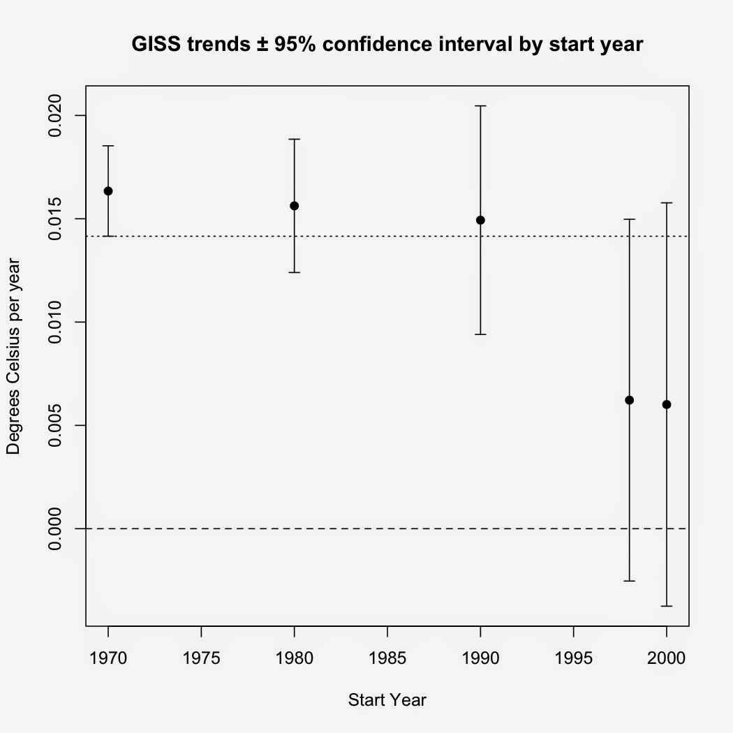
I had a question sent to me about the trend since 1998.  As many of you know, my last post included an analysis which showed that the linear regression trend since 1998 was statistically significant. Trends versus start year.  Error bars are the 95% confidence intervals. My questioner asked if I had accounted for autocorrelation in my analysis.  The short answer is "No, I did not."  The reason?  According to my analysis, it wasn't necessary. Here are my methods and R code. #Get coverage-corrected HadCRUT4 data and rename the first two columns CW<-read.table("http://www-users.york.ac.uk/~kdc3/papers/coverage2013/had4_krig_annual_v2_0_0.txt", header=F) names(CW)[1]<-"Year" names(CW)[2]<-"Temp" #Analysis for autocorrelation—I check manually as well but so far the auto.arima function has performed admirably. library(forecast) auto.arima(resid(lm(Temp~Year, data=CW, subset=Year>=1998)), ic=c("bic")) The su...

The "no warming" claim rises from the dead yet again.

Image
Like a movie vampire, this one keeps coming back no matter how many stakes are driven through its heart.  I've covered this one ( here , here , and here ).  Bluntly: There is absolutely no evidence that global warming has stopped.  For global warming to stop, the Earth's energy balance must be either zero or negative.  The most recent estimates for the energy imbalance are generally between +0.5 W/m 2 and +1.0 W/m 2 .  The only way the Earth is not going to warm while it is gaining energy is if the laws of thermodynamics magically do not apply.  If the Earth is gaining energy, some part of it, somewhere, must be getting warmer.  The heat must go into either melting ice, warming the oceans, warming the land, or warming the atmosphere (or some combination thereof).

WUWT and how NOT to test the relationship between CO2 and temperature

Image
WUWT published a piece by Danle Wolfe which purports to measure the correlation between CO 2 and global temperature.  As you can probably predict, Wolfe's conclusion is that there is no relationship. "Focusing on the most recent hiatus below, both visually and in a 1 st order linear regression analysis there clearly is effectively zero correlation between CO 2 levels and global mean temperature."  Unfortunately for Wolfe, all he's produced is a fine example of mathturbation as well as an example of forming a conclusion first then warping the evidence to fit.

James Taylor versus relative humidity and specific humidity

Image
It appears that the relative humidity and specific humidity continues to trip some people up.  Yes, I'm thinking of the screed James Taylor wrote on Forbes.com on Aug. 20 .  In his article, Taylor trumpets two "facts".  First, that relative humidity has declined and second, that specific humidity isn't rising as fast as global climate models predict.  Since climate models assume that relative humidity has stayed constant, Taylor then claims that models are overestimating global warming.  Unfortunately for Taylor, his "facts" don't check out.

R code for my Seasonal Trends graph

Image
I had a request for the code I used to generate the graphs in my Seasonal Trends post. While it looks complex, the R code for it is very simple IF you have the data ready.    I'm assuming that you already have the temperature dataset you want as an R object (I have several datasets in an object I simply call "monthly": GISS, Berkeley Earth, Cowtan-Way, HadCRUT4, UAH, and RSS, along with the year/decimal month Time, Year, and numeric Month).  The code I used to generate the graph is as follows: #Create separate datasets for each season monthly.79<-subset(monthly, Time>=1978.92 & Time<2013.91) DJF<-subset(monthly.79, Month=="12" | Month =="1" | Month=="2") DJF$Year_2 <- numeric (length (DJF$Year)) for (i in 1:length (DJF$Year) ) {         if ( DJF$Month [i] == 12) {                 DJF$Year_2[i] <-   DJF$Year [i] + 1         }     ...

One hundred years ago today...

Image
...the last passenger pigeon, a female named Martha, died in the Cincinnati Zoo.  A species that once had an estimated population size of 3 billion was destroyed in roughly 50 years by a combination of habitat loss and overhunting.  The story of that extinction is being told in numerous articles on this centenary (i.e. in Nature , Audubon Magazine , National Geographic ) and at museums like the Smithsonian Institute which tell the story far better than I could here.  The Audubon Magazine article, in particular, is well worth reading as it details the history of the extinction.

The Daily Fail: David Rose's newest cherry-pick.

Image
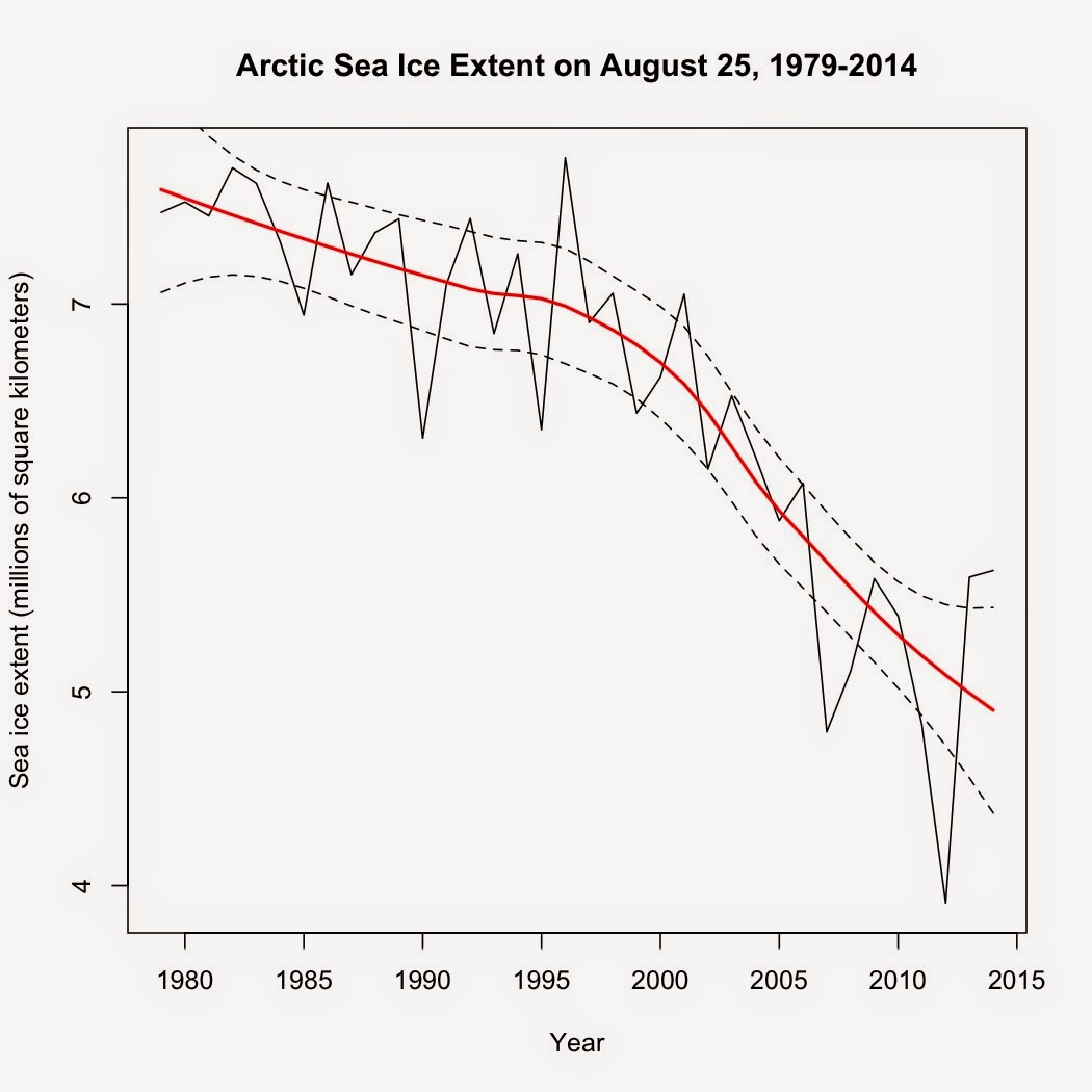
David Rose, who is no stranger to cherry-picking climate data and then weaving artful tales based on those cherry-picks, is back with yet another example of his perversity .  This time, he's trumpeting a 2-year increase in Arctic sea ice as measured on a single day: August 25, 2012 vs. August 25, 2014, claiming a 43% increase based on those two very specific days.  This is misleading for multiple reasons, one of which he himself admits in small type under that large flashy graphic at the top of his article: " These reveal that – while the long-term trend still shows a decline – last Monday, August 25, the area of the Arctic Ocean with at least 15 per cent ice cover was 5.62 million square kilometres." (emphasis added). So, just what does that long-term trend show? This:

So what if CO2 was 2400 ppmv in the Mesozoic

This is a response to those who try to claim that global warming won't be so bad.  The gist of their argument is that since life thrived in the Mesozoic when CO 2 was ~2400 ppmv and temperatures 8ºC warmer, climate change today isn't anything to be worried about.  Unfortunately, this argument ignores some very basic facts about biology and physics.  Here is some of what they're ignoring. 1) First, thanks to those individuals for accidentally confirming the relationship between CO 2 and global temperature, as well as modern estimates of climate sensitivity.  At modern solar radiation levels and with climate sensitivity at 0.809 W/m 2 , the equilibrium climate model predicts that with CO 2 at 2400 ppmv, global temperatures would rise by 9.3ºC above pre-industrial temperatures.  Factor in a weaker sun back in the Mesozoic and you get the 8ºC rise experienced from 2400 ppmv CO 2 back then ( Royer 2006 ).  Got to love it when those who dismiss science scor...

Roy Spencer and 95% of models are wrong

Image
Claims that 95% of climate models are wrong have been making the rounds since Spencer published it on his blog in February.  Here's the graph he created: Take a good look.  Not only does his graph appear to show that most models are higher than both HadCRUT4 and UAH satellite temperature record but it shows that HadCRUT4 is higher than UAH as well.  That is...strange, to say the least.  IPCC AR5 (aka CMIP5) models were calibrated against 20th century temperatures (1900-1999) and have only been actually predicting temperatures since 2000.  However, Spencer's graph appears to show that their output is higher than the observed temperature records for 1983-1999—during the calibration period.  That makes no sense at all.

More predictions of September Arctic sea ice extent

Image
I published a prediction of Arctic sea ice extent on July 1 that was based on September sea ice extent from 1979 to 2013.  That model yielded a prediction that the average extent for September 2014 would be 4.135 million square kilometers.  However, that model does not take into consideration any other information we have on Arctic sea ice, such as the ice extent in previous months of the year.  It just gives the general trend of sea ice in September from year to year.  You cannot use it to predict ice extent based on current ice extent or conditions.

Where does 2014 rank in the hottest years on record so far?

Image
While we're closing in on September, several of the global temperature datasets are still stuck on June and haven't released the July data yet.  Just for fun, let's compare how the first six months of 2014 stack up to previous years.  To answer the question in the title, I  averaged the first six months of each year in the Cowtan-Way global temperature dataset.

IPCC models versus actual trends

Image
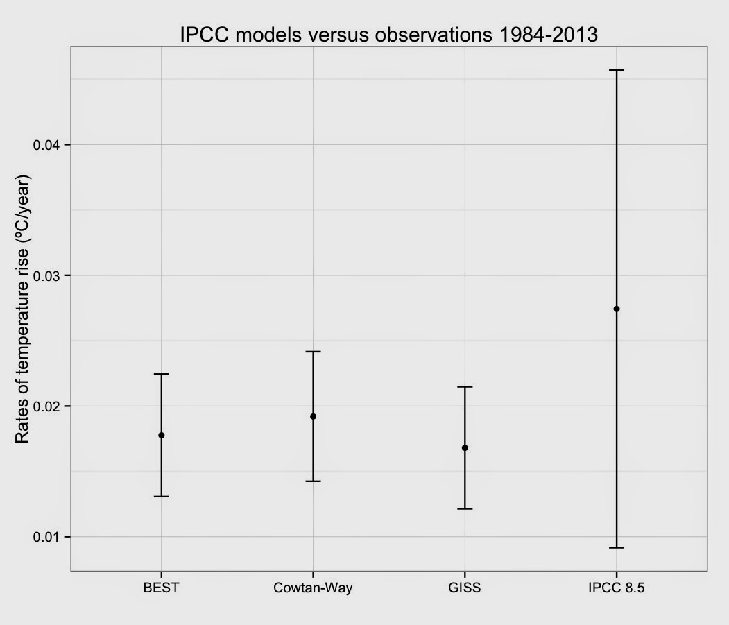
This is an extension of my previous post comparing IPCC models and actual temperature data .  I had a request to directly compare the observed rates of temperature rise with the predicted rise from the average of the AR5 models.  First, my methods:  I averaged all 81 IPCC AR5 8.5 models.  I then calculated the rate of change for the average of the models as well as Berkeley Earth's Land + Ocean dataset, the new Cowtan-Way coverage-corrected version of HadCRUT4, and GISS.  All rates were calculated after compensating for autocorrelation.  With that out of the way, here's the rates of temperature rise for the last 30 full years (1984-2013) in three surface datasets that cover the entire globe versus the average of all 81 IPCC AR5 8.5 scenarios:

Risbey et al. 2014

Image
It seems the canard about how IPCC models are inaccurate just won't go away.  I've covered it before on this blog .  The newest incarnation of that canard revolves around a new paper by Risbey et al. ( 2014 ).  It seems that many just don't understand what Risbey et al. did and they definitely don't understand the results of that paper.

Seasonal trends by hemisphere

Image
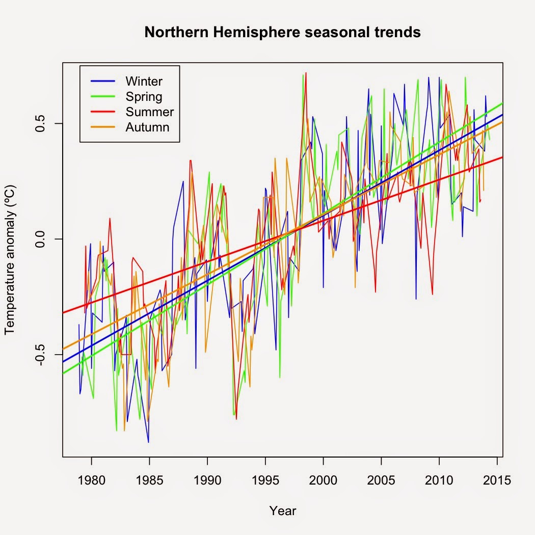
A reader raised a good question about my last post .  One of the confirmed predictions of climate change is that winters will warm faster than summers, yet my analysis showed that December-February warmed the least.  The question was why that would be.  The answer is simple: I used global temperature data.  December-February may be winter in the Northern Hemisphere but it is summer in the Southern.  The seasons largely cancel out.  The reason we see faster warming in the June-August  (Northern Hemisphere summer) versus December-February (Southern Hemisphere summer) is due to the position of land masses.  There's a greater proportion of ocean in the Southern Hemisphere and the ocean doesn't change temperature very readily compared to landmasses whereas the Northern Hemisphere has more landmass and consequently a larger response to seasonal changes in insolation.

Seasonal trends

Image
It is almost comical how people will grasp at any straw they can come up with to claim that global warming isn't happening.  The most recent bit of hilarity?  A claim that the winter trend since 2002 is cooling, therefore we're in global cooling, not global warming.  Let's check that one out to see just how ridiculous it is.

What will summers be in AD 2100?

While I'm working on a longer post, here is an interesting interactive graphic from Climate Central .  Just type in the city you are interested in and see what the summers will be for that city in AD 2100. It shows which US city (or world city) currently experiences average summer temperatures as hot as those predicted for selected US cities and gives you an idea of how far north the climate bands will have shifted over the next 86 years. Average summer highs in my current hometown are predicted to warm up by nearly 6.5ºC from the current average high of 29.4ºC to a predicted average high of 35.9ºC.  How much will your closest city warm?

NewsMax, Ambler, and BS about Antarctic sea ice

Image
NewsMax.com printed a poorly writen story about Antarctic sea ice intended to sow confusion amongst its readers which was unfortunately shared on my Facebook timeline by an acquaintance.  However, the article is even worse than being merely poorly written.  The "author," Sandy Fitzgerald, extensively plagiarizes a blog post by Harold Ambler while leaving out nearly everything Ambler wrote about why Antarctic sea ice is increasing.  Fitzgerald manages to make it sound like a new record extent in Antarctic sea ice somehow contradicts global warming.  Ambler's original is a far more nuanced argument.

How low will it go?

Image
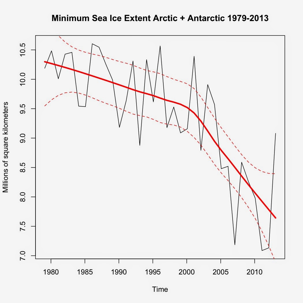
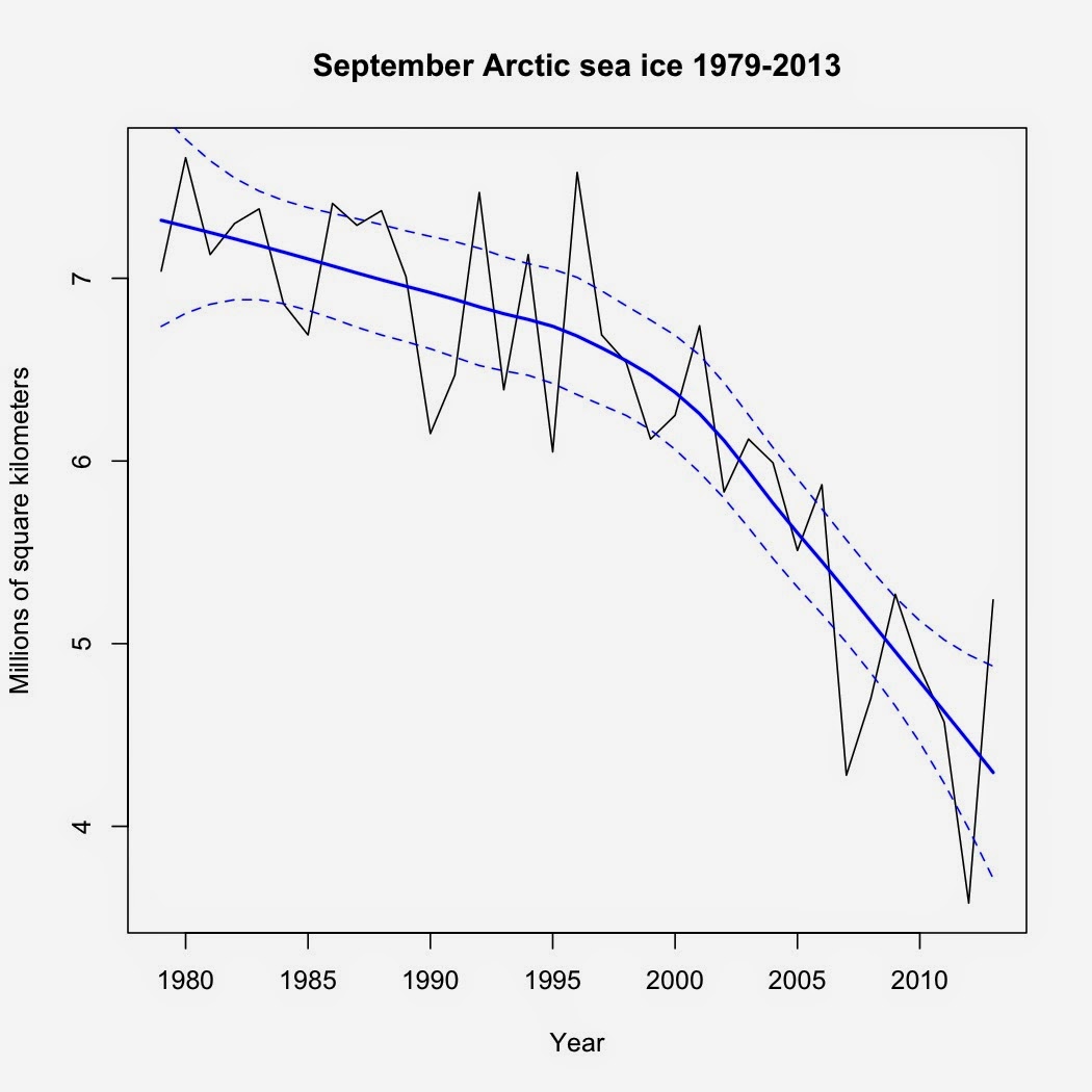
This is the time of year all eyes start turning toward the Arctic, specifically how rapidly and/or much the multiyear sea ice will melt this particular year.  Here is the average sea ice extent for September since 1979: I've added a loess regression line along with 95% confidence intervals to highlight the trend.  Despite last year's rebound from the 2012 low, the overall trend is decidedly down, with less multiyear ice remaining as time goes by. Now on to my prediction of what the ice will do this year.  What I did was simply to extrapolate based on the loess regression, which yielded a prediction of 4.135 million km 2 .  I also fitted a polynomial regression to the data, which produced a prediction of 4.085 million km 2 .  Both are well above the record low in 2012 (3.58 million km 2 ), showing how anomalous the 2012 low was.  If the loess curve holds, I wouldn't expect the trend to fall below the 2012 low until 2018. So, what is your prediction ...

Is it a requirement...

Image
for GOP politicians to be completely ignorant of science?  You have Phil Broun, a former physician who called evolution, embryology, and the Big Bang " lies straight from the pit of Hell ."  It's enough to make one wonder how he reacted to bacteria who have evolved antibiotic resistance and/or cared for any potentially pregnant patients, given that an understanding of embryology is rather integral to caring for such patients.  Then there's Ralph Hall, who claimed that climate scientists are essentially committing fraud for grant money , Dana Rohrabacher once claiming that dinosaur farts caused climate cycles in the past, and Phil Gingrey's claims that women's bodies can resist pregnancy arising from rape because a woman's body shuts down ovulation if she is stressed out.  Gingrey is a former OB/GYN.  Who believes that a woman's body can magically shut down its reproductive system if subjected to the stress of being raped....  My irony meter just broke....

A prediction of global surface temperatures if an El Niño forms this year.

Image
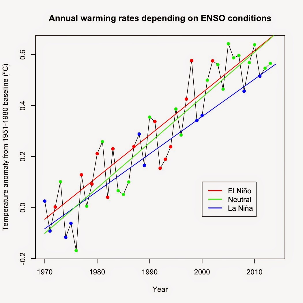
There are increasing evidence that we'll have our first El Niño since 2010 sometime within the next year.  Just for fun, I thought it would be interesting to try to predict what the annual global average temperature would be if an El Niño developed as expected. I took Berkeley Earth land + ocean annual temperature data starting in 1970 and categorized each year as El Niño, La Niña, or neutral using average MEI data for each year.  Any year with an MEI average  ≥ +0.5 was classed as an El Niño year.  La Niña years had MEI values ≤ -0.5, whereas neutral years were between -0.5 and +0.5.  I then performed a separate linear regression on each category.

The danger of anecdotal evidence

Anecdotal evidence is one of the most common forms of evidence.  We encounter it frequently in life, from those stories about the relative who tried some new cure to reports of children developing autism after receiving vaccines to stories on Fox News about how some snowstorm somehow disproves global warming.  However common, anecdotal evidence is the worst and most misleading form of evidence.

Another denier trying to baffle with BS

Image
On Huffington Post, I was challenged by a denier going by the screen name "Shuman the Human".  You can read the exchange here .  It's incomplete as for some reason my attempts to reply to his comment keep getting zapped.  Update: Looks like HuffPost zapped his last comment as well.

Yet another invasive insect.

Image
I've written before about the impact of the Emerald Ash Borer on forests in southwestern Ohio.  My introduction to the pest I'm profiling this time came last summer when I found my tomato, pumpkin, cucumber, acorn squash, watermelon, and summer squash vines infested with a strange brown bug with an oddly shaped abdomen: Halyomorpha halys (StÃ¥l), the brown mamorated stink bug. Picture from http://www.stopbmsb.org/stopBMSB/assets/Image/BMSB-on-bark-istock350w.png

New Berkeley Earth temperature dataset vs existing datasets

Image
The Berkeley Earth team released a new temperature analysis that includes both land and ocean surface temperatures .  They used their existing land data and merged it with HadSST data (note: not HadSST3 as I originally wrote), using kriging to interpolate temperatures where data did not directly exist.  In this, their methodology is similar to the recent Cowtan and Way ( 2013 ) paper, however, Cowtan and Way used HadSST3 for their ocean data.  I've compared their new results over the past 30 years (Jan 1984-Dec 2013) to GISS, HadCRUT4, NCDC, UAH, and Cowtan and Way's results, first standardizing all temperature anomalies to the 1981-2010 baseline.  Why the past 30 years?  Thirty years is generally considered the standard time period for measuring climate.  All trends mentioned in this article are calculated using linear regression corrected for autocorrelation.

Monckton, RSS, and no warming since September 1996

Image
While browsing a climate change article on Huffington Post, I noticed a global warming denier using a Watts Up With That post by Lord Monckton as "evidence" that global temperatures haven't changed since September 1996.  In it, Monckton uses least squares regression to show that satellite data from RSS is flat (trend: -0.0001394ºC per year) between September 1996 and January 2014.

Charles Krauthammer and settled science

Image
An op-ed in my local paper caught my eye yesterday.  By Charles Krauthammer, it's largely a fact-free repetition of talking points trying to dispute whether or not climate change is settled science.  While my hometown paper has the editorial paywalled, it's available at the Washington Post .  Some of his points are utterly unrelated, some are badly outdated, and some are out-right lies.

A Republican Meteorologist on climate change

This one is too good not to share.  It's the response of Paul Douglas, a meteorologist who happens to be a registered Republican, to a question on why more climate scientists do not enter the public debate (full response found here ).  His take-home line? "To the heart of your question, why don’t more climate scientists enter into the public debate? Because the debate is over. It’s the moral and scientific equivalent of debating gravity." As readers who peruse the archives of this blog know, I've spent quite a bit of time detailing why the scientific debate is over.  However, I have one quibble with Douglas' response: He fails to distinguish between the scientific debate and the public debate.  The question concerned the public debate—and the public debate is far from over.  Given the scientific illiteracy of many American voters ( 26% of whom don't even know that the Earth revolves around the sun ), it's been easy for fossil fuel interests to spread ...

California's drought

Image
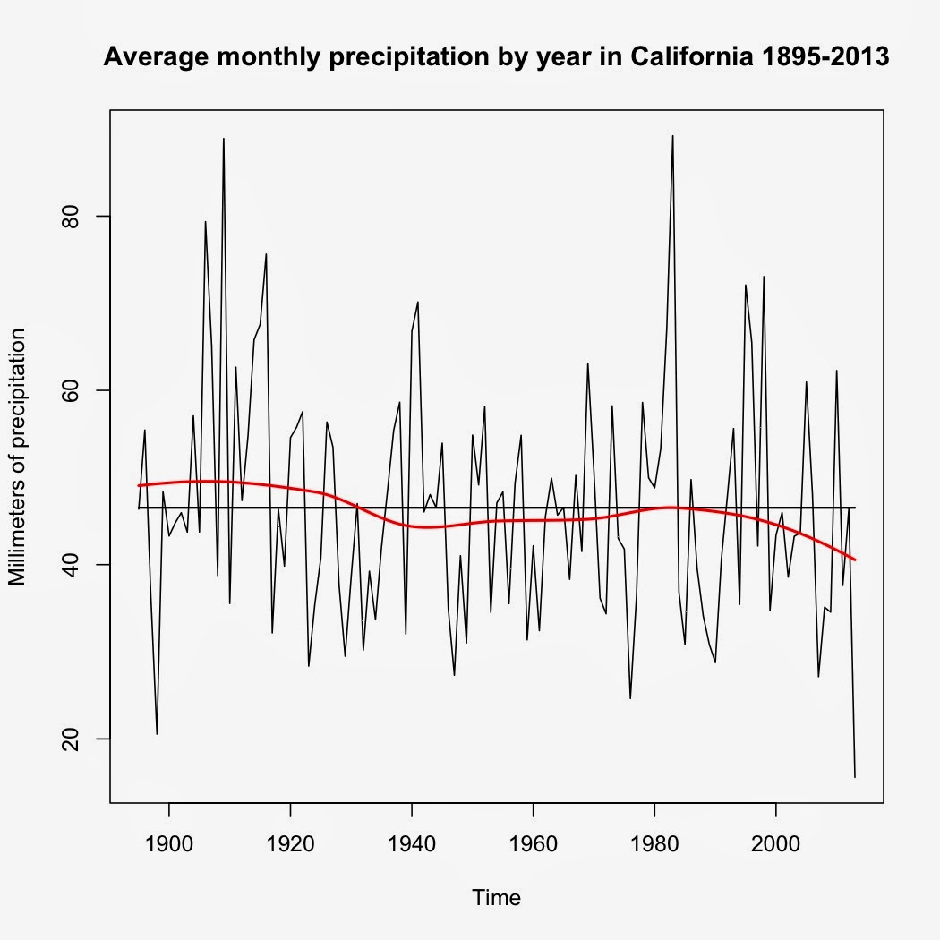
California's drought has been in the news quite a bit lately, complete with dire predictions for agriculture and food prices across the US.  The one question I had after reading several articles is "Just how bad is it?"  The answer: Really bad.

Answering a Gish Galloping critic, part 2

In case you missed it, the original comments I'm answering are found at the end of my bibliography of hockey sticks found here .  Part 1 of my response is here .  Now on to the second comment .

Answering a Gish Galloping critic, Part 1

Image
Apparently my post listing 36 publications that all show a "hockey-stick" has attracted some attention, including from a self-proclaimed paleogeneticist who claims that he's an expert in climate models .  I'm putting my response here, as responding to the Gish Gallop of BS he wrote would take far too much space in the comments section of that post.  If he doesn't like it?  Too bad.

2013 climate review

Image
2013 was notable in several ways, from the record warmth in Australia to the polar vortex that gripped the Eastern US in November and December due to a weakened Arctic polar jet stream and record drought in the US state of California, along with numerous extreme weather events around the globe .

Keystone cops

After digging through the recent State Department Environmental Impact Statement for the Keystone XL Pipeline , I am quite disappointed.  While right-wingers are cheering the fact that the State Department found that building Keystone XL won't have an impact on greenhouse gas emissions, that is the wrong conclusion.  In reality, the State Department found that the tar sand oil flowing through Keystone XL will generate the equivalent of 147 to 168 million metric tons of CO 2 emission per year (Executive Summary, page 15).  That is a sizable contribution to greenhouse gas emission from one single project.  It's between 57% and 65% of the average total CO2 emissions from all the world's volcanoes combined (average combined volcanic emissions per year: 260 million metric tons, see Gerlach 2011 ) and enough to raise atmospheric CO2 levels by 0.021 ppmv per year.  And the State Department somehow thinks that isn't going to impact greenhouse gas emissions? So, how c...

The problem with "All of the above"

Image
President Obama in his State of the Union address praised his "all of the above" energy strategy.  What he left out is that "all of the above" is a recipe for disastrous climate change. The 12-month running mean for Mauna Loa CO 2 levels is currently at 396.18 ppmv. With a climate sensitivity of 0.809ºC/W/m 2 (3ºC per doubling CO 2 ), that translates to warming of ΔT = λΔF = λ*[5.35 W/m 2 * ln(C/C 0 )] ΔT = 0.809ºC/W/m 2 * [5.35 W/m 2 * ln(396.18 ppmv/280 ppmv)] ΔT = 1.50ºC above pre-industrial levels with just the CO 2 levels of today.  However, that climate sensitivity value is just the 100-year value.  At longer time spans (i.e. 1,000 years), sensitivity is actually closer 1.618ºC/W/m 2 .  That means that at today's CO 2 levels, we're already committed to 3ºC of warming over the next millennium.  The key phrase?  "At today's CO 2 levels."  And that's the main problem I have with how President Obama is approaching the...

The last time the Earth had a 15-year cooling trend of any kind...

Image
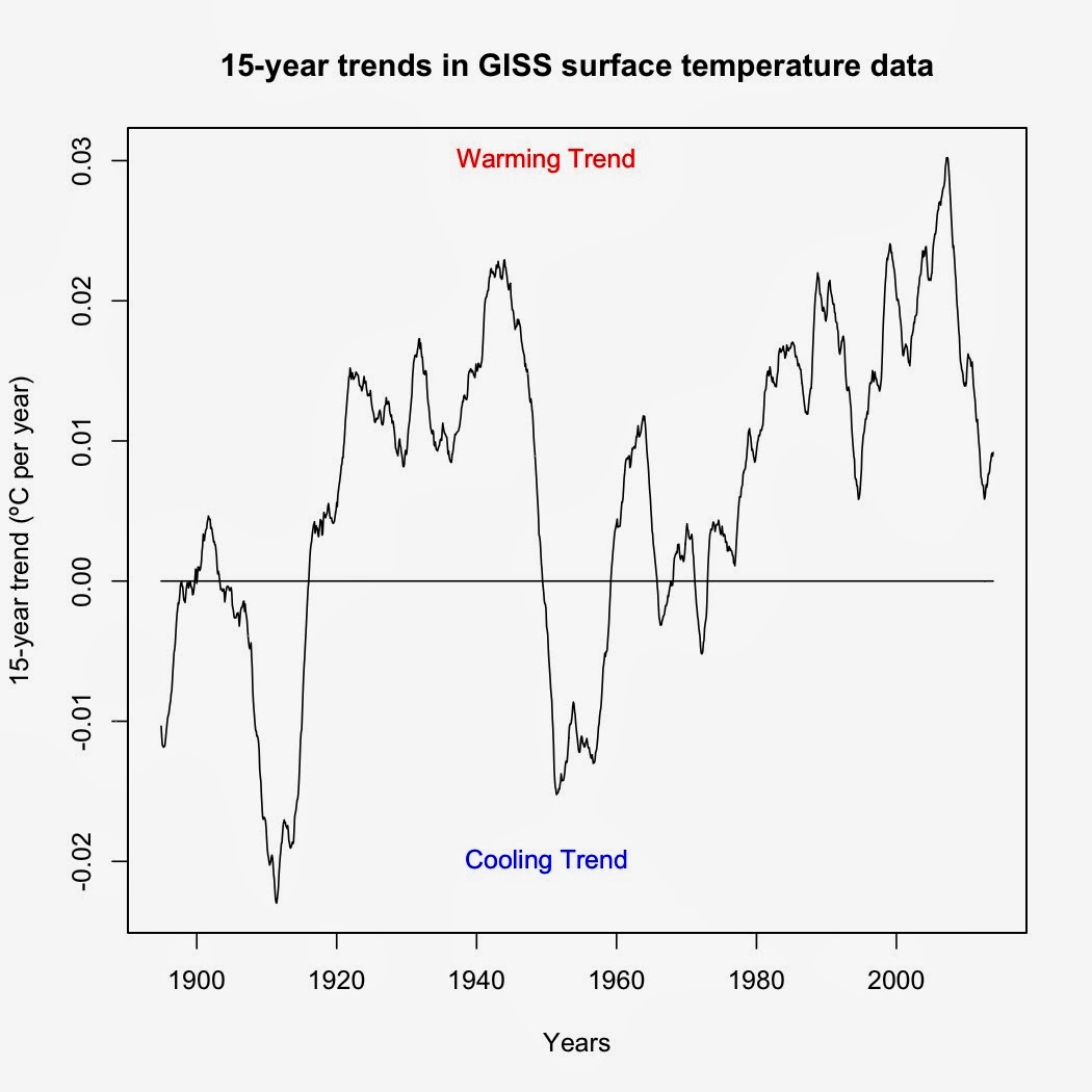
I was asked by a friend to identify the last time the Earth experienced a 15-year cooling trend.  The way I answered this was to use a rolling regression on GISS surface data (R code at the bottom).  Turns out that the last time was before I was born.  The period from February 1958-January 1973 (cooling of -0.00188ºC per decade) was the last 15-year cooling trend in GISS surface data.  Every 15-year period since has shown a warming trend of some magnitude—and yes, that even includes trends starting in 1998.   Figure 1.  Graph of temperature trends over each 15-year period.  Each point represents the trend over the preceding 15-year period. Now as to the last time the Earth showed a statistically significant 15-year cooling trend, well, that's a bit tougher to answer.  The code I'm using cannot account for autocorrelation, which means that it is biased toward showing significant time series trends when in reality the trends are not signific...

Ignorance, blindness, and outright misinformation

Image
A childhood acquaintance on Facebook posted a link to a CBN News article that serves as a good example of what is wrong with conservative news media.  Written by Dale Hurd, it is a mash-up of science denier canards with little in the way of actual science or evidence. The first paragraph sets the tone, making fun of the scientists who were trapped in Antarctic ice.  Nowhere does Hurd mention HOW the scientists were trapped: A storm packed sea ice into the bay their ship was in.  Now this can happen at any time of the year but it doesn't mean that the ice is growing.  It's summer down in Antarctica, a time when Antarctic sea ice melts from ~19 million km 2 in September down to ~2-3 million km 2 by March.  That leaves plenty of broken pack ice for winds to blow around, especially in the early part of the melt season such as December when the ship was trapped.  So the irony is that those scientists were trapped by MELTING sea ice, an irony completely los...

Polar vortex and global warming

Image
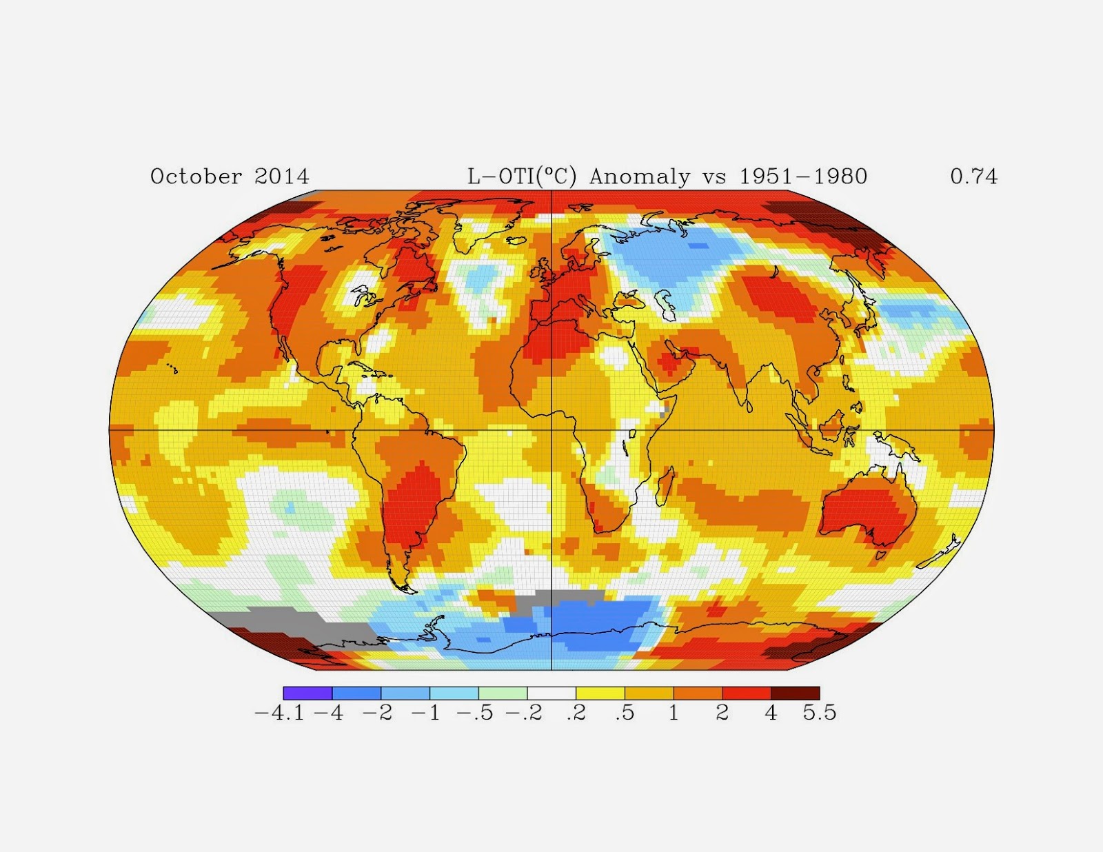
I've had several people to use the current cold weather in the US as "proof" that global warming isn't happening. Unfortunately for those arguments, they're pure bunk. First, the Eastern US and Canada do not represent the entire planet. The December 2013 global map of average temperature anomalies show this: While the eastern US and Canada are cold, the rest of the planet is relatively warm, with only a few areas (e.g. the Middle East) colder than the 1951-1980 average.  This same pattern has been in place since November 2013 and I expect that the January 2014 map won't change much.   [As expected, it did not.  Here's the January 2014 map:] Again, the Eastern US was far below average whereas the rest of the planet, especially much of the Arctic was far above average.]  This demonstrates the importance of looking at the global temperature data, rather than just the weather in your backyard when contemplating global warming. Second, th...