Posts

This idea might get some US politicians to do their jobs

Image
This sounds like a good idea.  Who knows?  Hitting science-denying politicians in one of the areas it hurts most (their public image) might do wonders for their ability to comprehend the science.   You can find out more about this plan (plus plenty of other information at http://climatenamechange.org .

A pause in global warming? What pause?!?

Image
Much has been made of the pause in global surface temperatures since 1998.  Among the factors advanced to explain that pause include a change in ENSO, a decline in solar output, and an increase in aerosols (i.e. Foster and Rahmstorf 2011 ).  One of the previously neglected factors is artificial cooling in global surface temperature data sets.  Neither the HadCRUT4 nor the NOAA temperature data cover the polar regions.  As the polar regions are the fastest warming areas on Earth (UAH Arctic trend since November 1978: +0.44ºC per decade, Global trend: +0.14ºC per decade), excluding those regions leads to an artificial cooling bias in the data. Anomaly map of HadCRUT4, showing the gaps in data coverage (in white) Both NOAA and GISS are artificially cooled by an outdated ocean temperature data set (HadSST2) that doesn't account for the change from ship-based temperature measurements to buoy-based temperature measurements that occurred within the last 10 years ( ...

It's cold in my backyard! Does that mean there's no global warming?

Image
Since October, deniers in the US have been pointing to the colder-than-normal weather in the US to claim that global warming has stopped.  In a twist that should blow their minds, NOAA/NCDC and GISS have both announced that November 2013 was the hottest November globally in recorded history. How can global temperatures set record highs if the US is so cold?  A temperature anomaly map from GISS answers that question nicely: Map available from NASA GISS Notice anything?  Yep.  Canada and the USA (particularly the Great Lakes region and Northeastern US), along with the Antarctic Peninsula are pretty much the only parts of the entire planet that were below average in November.  The rest of the Earth was average to well above average (check out Siberia!).  That's why November 2013 was the hottest November for the entire planet since at least 1880. The same global anomaly pattern appears in satellite data as well.  Lower tropospheric UAH data, whic...

IPCC models versus actual temperatures

Image
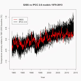
One of the dominant memes among climate deniers are that climate models are inaccurate.  While true, particularly since 1998 (see Fyfe et al. 2013 ), that fact doesn't mean that global warming isn't happening or that global warming is due to a natural cycle and not CO 2 as many deniers claim.  For those leaps of logic to be true, the entire field of radiative physics, 152 years of experiments, and 40+ years of satellite observations would all have to be wrong.  Nor does it mean that climate isn't as sensitive to changes in radiative forcing as multiple studies have shown it to be (i.e. Paleosens 2013 ).  What it means is far more complex. To illustrate this complexity, I compared IPCC AR5 climate models with surface temperatures (GISS).  The AR5 models were run with four scenarios, labeled RCP 2.6, RCP 4.5, RCP 6.0, and RCP 8.5.  Data for each scenario, along with global temperature data, AMO, PDO, etc. are available at Climate Explorer .  The RCP s...

Enough hockey sticks for a team

Image
One of the persistent denier myths is that the Hockey Stick (usually meaning Mann, M. E., R. S, Bradley, and M. K. Hughes. 1999. Northern Hemispheric Temperatures During the Past Millenium: Inferences, Uncertainties, and Limitations. Geophysical Research Letters . 26:759-762 ) has been discredited.  Not only is that myth false but Mann et al. (1999) has been validated through the publication of numerous hockey stick graphs since 1999.  Here is a brief list of the ones I know: Crowley, T. J. 2000. Causes of Climate Change Over the Past 1000 Years. Science 289:270-277 : Used both his own and Mann et al. (1999)'s hockey sticks to examine the cause of temperature changes over the past 1,000 years.  Found that natural forcings could not explain twentieth century warming without the effect of greenhouse gases. Huang, S, H. N. Pollack, and P. Shen. 2000. Temperature Trends over the past five centuries reconstructed from borehole temperatures. Nature 403:756-758 : Reconstru...

How to spot outliers in regression analysis

Image
Much of the debate over the possible pause in surface temperatures since 1998 really hinges on 1998 being an outlier.  And not only an outlier but an influential data point, which means that its very presence changes the overall regression trend.  In this post, I'll show how to identify outliers, high-leverage data points, and influential data points. First, some basic definitions.  An outlier is any data point that falls outside the normal range for that data set, usually set as being 2 standard deviations from the average.  In regression analyses, an outlier is any data point where its residual falls outside the normal range.  High leverage data points are made at extreme values for the independent variables such that there are few other data points around, regardless of whether or not those data points change the overall trend.  An influential data point is an extreme outlier with high leverage that alters the overall trend. Now for the analysis, sta...

A primer on the greenhouse effect

Image
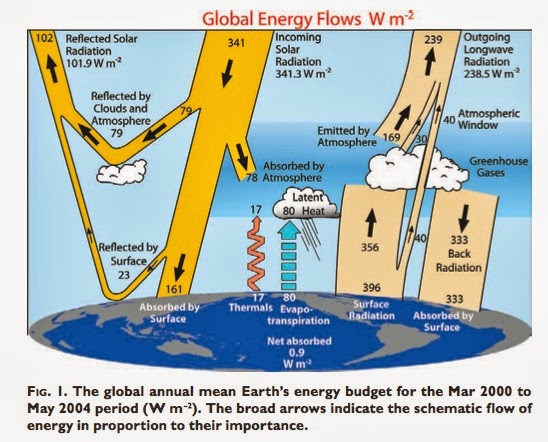
Looking back at my first posts, I realized that I had neglected to explain the greenhouse effect.  This post is intended to rectify that omission. First a basic principle: All energy that enters or leaves the Earth's atmosphere must be in the form of radiation.  And yes, that includes heat.  There's no atmosphere in space so heat cannot be lost from the planet via conduction and convection.  The general process is as follows. 1) Energy from the sun (including ultraviolet and visible radiation) enters the atmosphere. 2) About 30% of the sun's radiation is reflected back into space by aerosols in the air (produced by volcanoes and coal-fired power plants) or via snow, ice, and other light-colored surfaces.  Of the 70% that reaches the ground, most is visible light as most ultraviolet is absorbed by the ozone layer. 3) When visible light reaches the ground, the energy is absorbed by the surfaces on the ground.  That absorbed energy is reradiated as inf...