Posts

The problem with "All of the above"

Image
President Obama in his State of the Union address praised his "all of the above" energy strategy.  What he left out is that "all of the above" is a recipe for disastrous climate change. The 12-month running mean for Mauna Loa CO 2 levels is currently at 396.18 ppmv. With a climate sensitivity of 0.809ºC/W/m 2 (3ºC per doubling CO 2 ), that translates to warming of ΔT = λΔF = λ*[5.35 W/m 2 * ln(C/C 0 )] ΔT = 0.809ºC/W/m 2 * [5.35 W/m 2 * ln(396.18 ppmv/280 ppmv)] ΔT = 1.50ºC above pre-industrial levels with just the CO 2 levels of today.  However, that climate sensitivity value is just the 100-year value.  At longer time spans (i.e. 1,000 years), sensitivity is actually closer 1.618ºC/W/m 2 .  That means that at today's CO 2 levels, we're already committed to 3ºC of warming over the next millennium.  The key phrase?  "At today's CO 2 levels."  And that's the main problem I have with how President Obama is approaching the...
The last time the Earth had a 15-year cooling trend of any kind...

Image
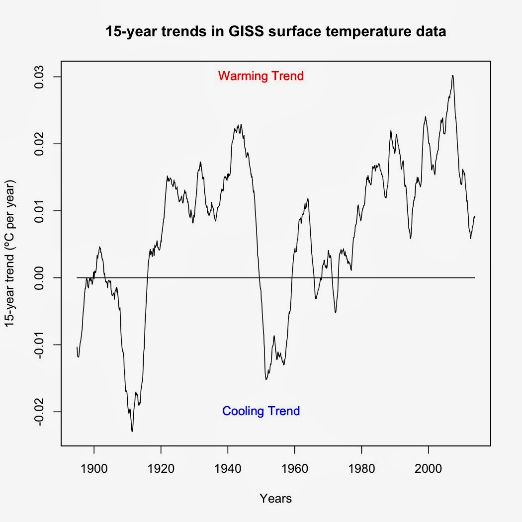
I was asked by a friend to identify the last time the Earth experienced a 15-year cooling trend.  The way I answered this was to use a rolling regression on GISS surface data (R code at the bottom).  Turns out that the last time was before I was born.  The period from February 1958-January 1973 (cooling of -0.00188ºC per decade) was the last 15-year cooling trend in GISS surface data.  Every 15-year period since has shown a warming trend of some magnitude—and yes, that even includes trends starting in 1998.   Figure 1.  Graph of temperature trends over each 15-year period.  Each point represents the trend over the preceding 15-year period. Now as to the last time the Earth showed a statistically significant 15-year cooling trend, well, that's a bit tougher to answer.  The code I'm using cannot account for autocorrelation, which means that it is biased toward showing significant time series trends when in reality the trends are not signific...

Ignorance, blindness, and outright misinformation

Image
A childhood acquaintance on Facebook posted a link to a CBN News article that serves as a good example of what is wrong with conservative news media.  Written by Dale Hurd, it is a mash-up of science denier canards with little in the way of actual science or evidence. The first paragraph sets the tone, making fun of the scientists who were trapped in Antarctic ice.  Nowhere does Hurd mention HOW the scientists were trapped: A storm packed sea ice into the bay their ship was in.  Now this can happen at any time of the year but it doesn't mean that the ice is growing.  It's summer down in Antarctica, a time when Antarctic sea ice melts from ~19 million km 2 in September down to ~2-3 million km 2 by March.  That leaves plenty of broken pack ice for winds to blow around, especially in the early part of the melt season such as December when the ship was trapped.  So the irony is that those scientists were trapped by MELTING sea ice, an irony completely los...

Polar vortex and global warming

Image
I've had several people to use the current cold weather in the US as "proof" that global warming isn't happening. Unfortunately for those arguments, they're pure bunk. First, the Eastern US and Canada do not represent the entire planet. The December 2013 global map of average temperature anomalies show this: While the eastern US and Canada are cold, the rest of the planet is relatively warm, with only a few areas (e.g. the Middle East) colder than the 1951-1980 average.  This same pattern has been in place since November 2013 and I expect that the January 2014 map won't change much.   [As expected, it did not.  Here's the January 2014 map:] Again, the Eastern US was far below average whereas the rest of the planet, especially much of the Arctic was far above average.]  This demonstrates the importance of looking at the global temperature data, rather than just the weather in your backyard when contemplating global warming. Second, th...

This idea might get some US politicians to do their jobs

Image
This sounds like a good idea.  Who knows?  Hitting science-denying politicians in one of the areas it hurts most (their public image) might do wonders for their ability to comprehend the science.   You can find out more about this plan (plus plenty of other information at http://climatenamechange.org .

A pause in global warming? What pause?!?

Image
Much has been made of the pause in global surface temperatures since 1998.  Among the factors advanced to explain that pause include a change in ENSO, a decline in solar output, and an increase in aerosols (i.e. Foster and Rahmstorf 2011 ).  One of the previously neglected factors is artificial cooling in global surface temperature data sets.  Neither the HadCRUT4 nor the NOAA temperature data cover the polar regions.  As the polar regions are the fastest warming areas on Earth (UAH Arctic trend since November 1978: +0.44ºC per decade, Global trend: +0.14ºC per decade), excluding those regions leads to an artificial cooling bias in the data. Anomaly map of HadCRUT4, showing the gaps in data coverage (in white) Both NOAA and GISS are artificially cooled by an outdated ocean temperature data set (HadSST2) that doesn't account for the change from ship-based temperature measurements to buoy-based temperature measurements that occurred within the last 10 years ( ...

It's cold in my backyard! Does that mean there's no global warming?

Image
Since October, deniers in the US have been pointing to the colder-than-normal weather in the US to claim that global warming has stopped.  In a twist that should blow their minds, NOAA/NCDC and GISS have both announced that November 2013 was the hottest November globally in recorded history. How can global temperatures set record highs if the US is so cold?  A temperature anomaly map from GISS answers that question nicely: Map available from NASA GISS Notice anything?  Yep.  Canada and the USA (particularly the Great Lakes region and Northeastern US), along with the Antarctic Peninsula are pretty much the only parts of the entire planet that were below average in November.  The rest of the Earth was average to well above average (check out Siberia!).  That's why November 2013 was the hottest November for the entire planet since at least 1880. The same global anomaly pattern appears in satellite data as well.  Lower tropospheric UAH data, whic...