Posts

Showing posts with the label R

R code for Shifting Bell Curves
Image
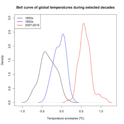
A commentator named Jonathan asked for the code by which I produced my bell curve graph way back in 2013. Here it is. Note : I'm using the Cowtan and Way 2.0 temperature reconstruction in this example rather than NASA GISS as in the original post as the Cowtan and Way data is more accessible for use in R. >Cowtan<-read.table("http://www-users.york.ac.uk/~kdc3/papers/coverage2013/had4_krig_v2_0_0.txt", header=F) > names(Cowtan)<-c("Year", "Temperature", "Uncertainty1", "Uncertainty2", "Uncertainty3") #Name the columns > summary(Cowtan) #Check to see if the column names look right and the data imported correctly > S1850s<-subset(Cowtan, Year<1860) #Get subsets of each decade > S1950s<-subset(Cowtan, Year>=1950 & Year<1960) > S2007<-subset(Cowtan, Year>=2007 & Year<2017) > D1850s=density(S1850s$Temperature) #Get the density kernals > D1950s<-density(S1...

Trend since 1998—significant??

Image
I had a question sent to me about the trend since 1998.  As many of you know, my last post included an analysis which showed that the linear regression trend since 1998 was statistically significant. Trends versus start year.  Error bars are the 95% confidence intervals. My questioner asked if I had accounted for autocorrelation in my analysis.  The short answer is "No, I did not."  The reason?  According to my analysis, it wasn't necessary. Here are my methods and R code. #Get coverage-corrected HadCRUT4 data and rename the first two columns CW<-read.table("http://www-users.york.ac.uk/~kdc3/papers/coverage2013/had4_krig_annual_v2_0_0.txt", header=F) names(CW)[1]<-"Year" names(CW)[2]<-"Temp" #Analysis for autocorrelation—I check manually as well but so far the auto.arima function has performed admirably. library(forecast) auto.arima(resid(lm(Temp~Year, data=CW, subset=Year>=1998)), ic=c("bic")) The su...

The "no warming" claim rises from the dead yet again.

Image
Like a movie vampire, this one keeps coming back no matter how many stakes are driven through its heart.  I've covered this one ( here , here , and here ).  Bluntly: There is absolutely no evidence that global warming has stopped.  For global warming to stop, the Earth's energy balance must be either zero or negative.  The most recent estimates for the energy imbalance are generally between +0.5 W/m 2 and +1.0 W/m 2 .  The only way the Earth is not going to warm while it is gaining energy is if the laws of thermodynamics magically do not apply.  If the Earth is gaining energy, some part of it, somewhere, must be getting warmer.  The heat must go into either melting ice, warming the oceans, warming the land, or warming the atmosphere (or some combination thereof).

The last time the Earth had a 15-year cooling trend of any kind...

Image
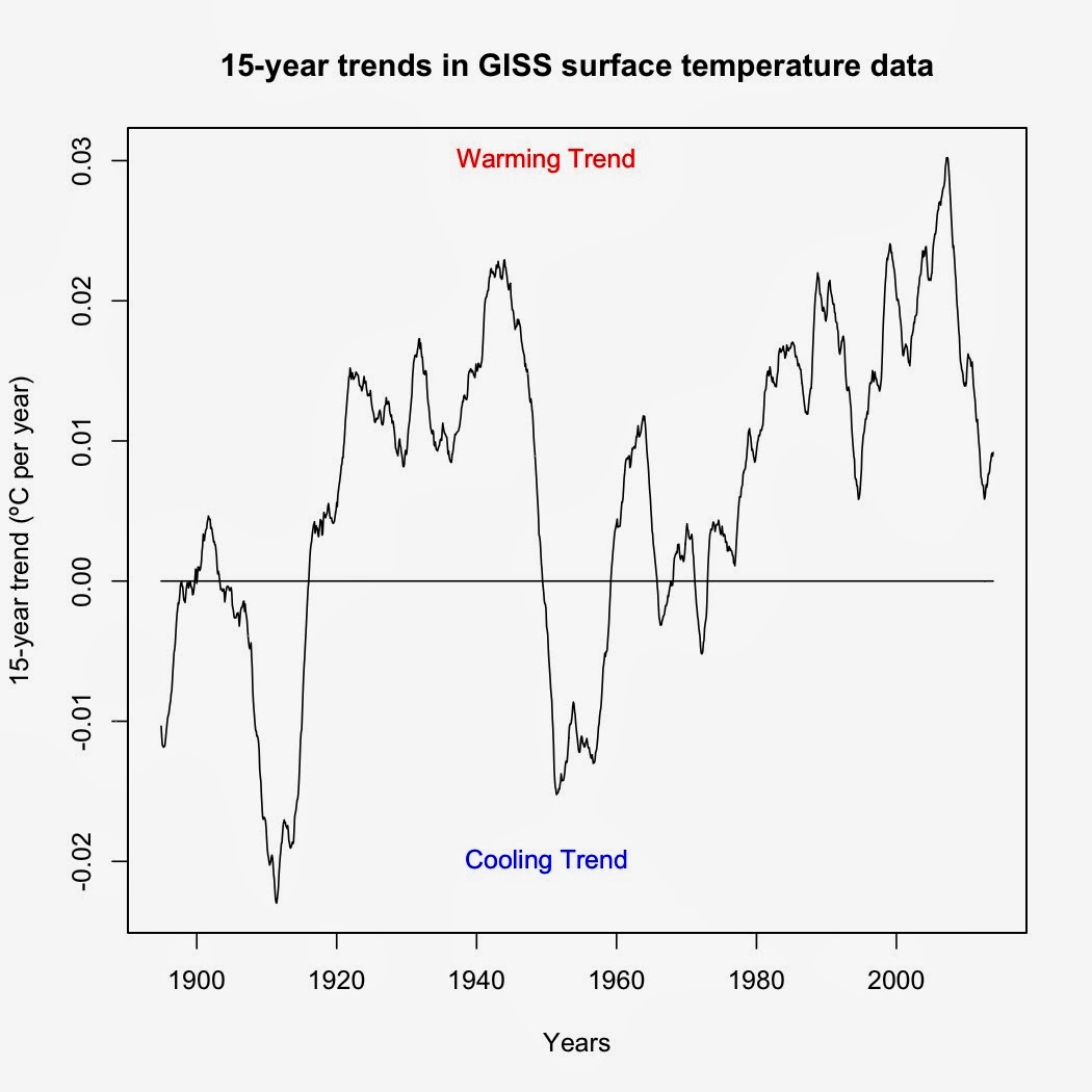
I was asked by a friend to identify the last time the Earth experienced a 15-year cooling trend.  The way I answered this was to use a rolling regression on GISS surface data (R code at the bottom).  Turns out that the last time was before I was born.  The period from February 1958-January 1973 (cooling of -0.00188ºC per decade) was the last 15-year cooling trend in GISS surface data.  Every 15-year period since has shown a warming trend of some magnitude—and yes, that even includes trends starting in 1998.   Figure 1.  Graph of temperature trends over each 15-year period.  Each point represents the trend over the preceding 15-year period. Now as to the last time the Earth showed a statistically significant 15-year cooling trend, well, that's a bit tougher to answer.  The code I'm using cannot account for autocorrelation, which means that it is biased toward showing significant time series trends when in reality the trends are not signific...

How to spot outliers in regression analysis

Image
Much of the debate over the possible pause in surface temperatures since 1998 really hinges on 1998 being an outlier.  And not only an outlier but an influential data point, which means that its very presence changes the overall regression trend.  In this post, I'll show how to identify outliers, high-leverage data points, and influential data points. First, some basic definitions.  An outlier is any data point that falls outside the normal range for that data set, usually set as being 2 standard deviations from the average.  In regression analyses, an outlier is any data point where its residual falls outside the normal range.  High leverage data points are made at extreme values for the independent variables such that there are few other data points around, regardless of whether or not those data points change the overall trend.  An influential data point is an extreme outlier with high leverage that alters the overall trend. Now for the analysis, sta...

Compensating for autocorrelation in global temperature data

Image
Autocorrelation in global temperature data simply means that the average temperature for any one month is correlated with the average temperature of the previous month.  It is an unfortunately common problem when dealing with time series and spatial statistics.  The gist of the issue is that most of the standard statistical analysis techniques such as ANOVA, regression, and the like assume that variation in the data is random or white noise when calculating standard errors and p-values.  Autocorrelation means that the noise in the data is not random but correlated or red noise.  The degree of correlation reduces the effective size of the data set and means that the standard errors and p-values calculated from normal statistical tests will be lower than they should be and biased toward showing statistical significance when in reality the tests should not show significance. One of the best ways to compensate for autocorrelation is to use an Autoregressive Integrated ...

Time series decomposition in R

Image
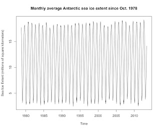
Time series analysis is one of those scary sounding terms that in reality is very simple.  All it means is that you have data where the independent variable is time (seconds, minutes, hours, days, weeks, months, or years) and a dependent that changes over time.  Time series analysis is just methods for detecting trends in the dependent variable over time. The most basic time series analysis is linear regression, which I previously covered here .  In this post, I'll discuss time series decomposition.  Time series decomposition means that you break a time series into its constituent parts: Trend, seasonal, and random.  Seasonal means changes that occur in a regular cycle over the course of a year.  Random is random fluctuations within a time series that are neither part of the seasonal pattern nor the trend.  I'll demonstrate time series decomposition using Antarctic sea ice data . First, a graph of monthly average Antarctic sea ice since satellite...

A quick tutorial in R

Image
I've had a request for a quick tutorial on how to get started using R.  R is a statistical language that analyzes data and saves results in files called "objects."  You can then use the objects to create new analyses and objects.  Note: Wherever you see a "#", what follows is a comment.  You can delete that comment before running the code or leave it in—R ignores anything that follows a # sign.  Here's how I get my students started.