Posts

New blog home!

 As you already know, I use R and RStudio for all of my data analyses. While Blogger is perfectly adequate for most needs, I've personally found it to be cumbersome when trying to publish anything with graphs from R. I've always had to export graphs from RStudio and then reimport them to this blog. And don't get me started on formatting R code for publication. I cringe when I see how my code was mangled by Blogger. Accordingly, I'm moving my blog to  Quarto Pub . Quarto is a newly released version of RMarkdown, both were originally created for R and RStudio. Quarto allows me to merge R code and output with text to create blogs, reports, presentations, and even entire websites, all from RStudio on my laptop. Anyone can now access my code, reproduce my results, and improve upon my analysis, right from my blog post. No need for separate posts or blog sections on code. Hope to see all of you over at my new site (URL:  https://jrmilks.quarto.pub/seeing-the-environmental-f...

Global temperature widget

Image
 I've created a web-based app that calculates linear regression trends on the Cowtan-Way global temperature data set  using annual mean temperature. The reason I picked that particular data set is simply that it's one of the easiest of the surface temperature data sets to download to R.  I chose annual data because red noise is insignificant at that scale so we can go with linear regression without worrying about autoregression. The app was made using the Shiny app in R Studio. When you open the app, you're greeted by a single page with two input boxes on the left-hand side. You enter the start year in the top box and end year in the bottom box and the Shiny app does the rest. The output includes the linear temperature trend per 100 years, the 95% confidence interval for that trend, a graph of the data and trend, complete with 95% confidence interval lines, and at the bottom the actual R output listing the model and fit statistics like the R 2 statistic.  I've demon...

Shifting Bell Curves revisited

Image
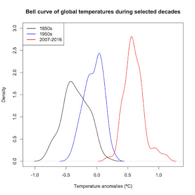
 It's been a few years (close to four) since I last wrote a post. Yes, I'm still alive. Life just...got complicated for a bit. While much has been happening, it seems that outright climate change denial is finally dying, probably because we're already seeing it happen before our very eyes. In this post, I'm revisiting the Shifting Bell Curves I first wrote about in 2013. Here we go. One of the tenants of climate change is that it changes the frequency and probability of climate-related events. Here I use NCDC data broken into decades to show how the frequency of monthly global mean temperatures changed over time. We're all familiar with time series plots of temperature data such as the one below showing that global mean temperatures have risen by an average of 0.179ÂșC per decade (95% confidence interval: 0.171 to 0.188ÂșC) since 1970. However, this way, while still informative, doesn't allow the reader to really grasp just how much the distribution of monthly me...

Christopher Booker doesn't understand trends

Image
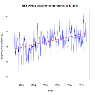
Christopher Booker, a journalist for The Telegraph in England, has a long history of disputing scientific facts. Not only does he dispute climate change, he also disputes the link between smoking and cancer (hey, he fits right in with Heartland Institute) and the negative effects of asbestos. On May 6, 2017, he published yet another column on climate change proclaiming that all is well. Titled " Another Arctic ice panic is over as world temperatures plummet ", it has been quickly picked up by the usual science denial websites. As usual. Never mind that it's chock full of misinformation and outright ignorance. Let's get started. First up, the selected facts present in the following paragraph in his article:  "But last week we were brought back to earth by the Danish Meteorological Institute (DMI), as charted by our friend Paul Homewood on his blog Notalotofpeopleknowthat, with the news that ever since December temperatures in the Arctic have consistently be...

Meltdown: An early prediction of September 2017 Actic sea ice extent

Image
Yes, I'm a bit late but the Arctic is in full meltdown this year. I crunched the numbers for April ice extent and found that this past April saw the second-lowest Arctic sea ice extent on record. Since 1979, average sea ice extent in April has declined by 1,403,600 square kilometers, an area nearly the size of Alaska and over twice the size of Texas. (Alaska has an area of 1,717,854 square kilometers and Texas comes in at 696,241 square kilometers. You can find a list of all 50 states at ThoughtCo.com in case you're curious). Even more worrisome is the record low average extent in the first four months of this year. Average monthly January to April extent has fallen by 1,626,860 square kilometers since 1979. This record low comes in spite of neutral ENSO conditions, indicating that something has changed in the Arctic and not for the better. Sea ice volume makes the point even more clear. So far, sea ice volume is setting new record lows, meaning there is a lot of th...

R code for Shifting Bell Curves

Image
A commentator named Jonathan asked for the code by which I produced my bell curve graph way back in 2013. Here it is. Note : I'm using the Cowtan and Way 2.0 temperature reconstruction in this example rather than NASA GISS as in the original post as the Cowtan and Way data is more accessible for use in R. >Cowtan<-read.table("http://www-users.york.ac.uk/~kdc3/papers/coverage2013/had4_krig_v2_0_0.txt", header=F) > names(Cowtan)<-c("Year", "Temperature", "Uncertainty1", "Uncertainty2", "Uncertainty3") #Name the columns > summary(Cowtan) #Check to see if the column names look right and the data imported correctly > S1850s<-subset(Cowtan, Year<1860) #Get subsets of each decade > S1950s<-subset(Cowtan, Year>=1950 & Year<1960) > S2007<-subset(Cowtan, Year>=2007 & Year<2017) > D1850s=density(S1850s$Temperature) #Get the density kernals > D1950s<-density(S1...

Mt. Etna vs Humans

Image
Yes, I'm still around. I've just been fairly busy the past few months. The long-debunked myth that Mt. Etna emits more carbon dioxide in one little eruption than human activities have for our entire history as a species has recently reappeared on my social media feed, courtesy of a right-wing cousin of mine.  I just thought I'd do a quick comparison showing just how wrong that myth is. Using data from tables 2 and 3 in Burton, Sawyer, and Granieri (2013) for volcanic emissions and Boden, Marland, and Andres (2017) for human-related carbon dioxide emissions, I get the following comparison between an entire year's worth of Mt. Etna CO 2 emissions and just one year's worth of human-caused CO 2 emissions. Mt. Etna produces an average of 7.22 million metric tons of CO 2 per year. That's TOTAL per year, not just "one little burp." In contrast, humans caused 36.14 BILLION metric tons of CO 2 emissions in 2014 alone. Mt. Etna emissions aren...

Climate of 2016 to date

Image
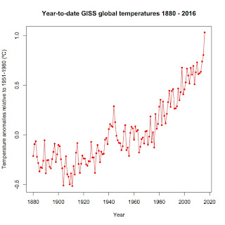
No, I'm not talking about the recently concluded US election that saw a scientific illiterate ascend to the presidency. Given the lack of details about Donald Trump's intended policies, it's impossible to say what, exactly, his election means for science in the US although I have doubts that it means anything good given his stated antithesis toward science, particularly climate science. I will instead focus on some significant events that have been eclipsed in the media frenzy around the presidential campaign. First up, global temperature. Has it been hot enough for you? Here are January through September temperatures for every year in the GISS record.  So far, 2016 has obliterated the previous record for January - September global temperature anomaly set in 2015, 1.03ÂșC to 0.80ÂșC. Not only is the average for the first nine months hotter but eight of those months are the hottest respective months on record, with only June 2016 (in third place) the lone non-record-sette...

1996 versus 2016 in a Facebook meme

Image
Recently, a right-wing cousin of mine shared a meme claiming that global temperatures were unchanged between 1996 and 2016, specifically that global temperatures were 14.83ÂșC (58.7ÂșF) in both 1996 and 2016. I call BS and here's why. First and most obviously, 2016 isn't even half over.  Stating that the mean temperature in 2016 was 14.83ÂșC (58.7ÂșF) is a bit premature. Second, whoever came up with that meme has extreme difficulty with basic statistical terms. Here's a hint: "Average mean temperature" is nonsense.  As used in everyday speech, it's essentially the same as saying "average average temperature" or "mean mean temperature." Now, for those who understand statistics, I know that the mean is technically a specific method for calculating the average but in general usage, mean and average are interchangeable—and whoever came up with that meme was abjectly ignorant of that fact. Third, the meme author had even more...

Hottest start to a calendar year on record

Image
NASA updated their global temperature data for April and it's hot.  Really hot.  As in the last time it was this hot may well be the Holocene Climatic Optimum.  April 2014 shattered April 2010's record by a full 0.24ÂșC, coming in at 1.11ÂșC above the 1951-1980 baseline.  That is, simply put, jaw-dropping.

Climategate—Seriously??

It's hard to believe that anyone at this point takes the so-called Climategate seriously.  Yet I have encountered several individuals recently who appear to sincerely believe that Climategate was a real scandal that somehow disproves all the scientific evidence for climate change/global warming accumulated over the past 150+ years.

A taste of 2049

Image
Long time, no see.  Sorry for the lengthy time between entries.  Real life has gotten quite complicated of late.  So, let's hit one major topic that has been in the news of late: The absolutely sizzling start to 2016.  Just how sizzling has it been?  Take a look:

What are the odds that 2015 will not be the hottest year on record?

Image
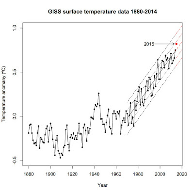
Let me be upfront with you: I think it's a foregone conclusion that 2015 will beat out 2014 as the hottest year on record. However, I decided to test that idea, just to be certain. The way I did it was simple: I first calculated the year-to-date average (January - July) and then calculated what the August — December average would have to be to keep the 2015 average temperature at or below that of 2014. I then calculated the August — December average for each year since 1970, fitted a trend, and calculated the standard deviation of the residuals. Last, I calculated the expected August - December average for 2015 given the trend and the difference between the expected August - December average and what that average would have to be to keep 2015 from setting a new record.  I then used z-scores to calculate the probability that the remainder of 2015 would fall to that level or below. Annual global temperature according to NASA GISS since 1970 Year to date, 2015 sits at +0.82...

Global warming, The Wall Street Journal, and John Gordon

Image
John Steele Gordon published a commentary in The Wall Street Journal on July 30 that, on its face, sounds reasonable.  Gordon makes the case that we should be cautious about calling climate science settled as science is always changing.  No real quibbles there, as science has shown that nothing is ever truly "settled" science.  Unfortunately, that's as close to reality as Gordon comes.  The rest of the commentary simply shows off Gordon's simplistic view of history, science, and, especially, the current state of climate science.

Hottest first six months on record

Image
I know, I know, I'm behind a bit.  Most of the stories on the first six months of this year came nearly a month ago.  Better late than never.  By now, we all know that the world is headed toward its hottest year ever, breaking the record set just last year.  In this post, I'm going to analyze just how abnormal normal the first half of the year has been.

James Taylor gets polar ice wrong—as usual

Image
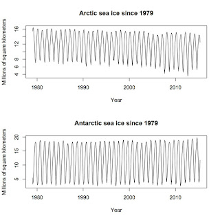
James Taylor of the Heartland Institute had a piece on Forbes back in May that escaped my attention when it first came out.  Titled " Updated NASA Data: Global Warming Not Causing Any Polar Ice Retreat ", it focused on the single premise that since 2012, total polar sea ice was above the average since 1979.  Taylor then jumped to the erroneous conclusions that a) polar sea ice was not retreating and b) global warming will be entirely beneficial to humans.  His arguments are familiar, as I dealt with them before when a Newsmax article featured them back in 2014 .  He's recycling old talking points, so this post is going to echo the one I wrote a year ago.

The Ice Age Cometh?

Image
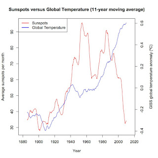
Recent media reports have claimed that a drop in solar activity will lead to a mini-Ice Age within the next 15 years.  Unfortunately, even press reports from science-related media such as Science Daily , have been riddled with errors. Let's get the biggest one out of the way first.  Zharkova et al. ( 2015 ) did not predict a new Little Ice Age (LIA).  What they did was use principle component analysis to detect and model magnetic waves within the sun.  They found that there were two such waves, each with an 11-year cycle, that either interfered with each other when sunspot activity was low or magnified each other when sunspot activity was high.  They then ran their statistical model ahead to make a prediction for the next solar cycle and found that their model predicts that the waves should cancel each other out, resulting in their subsequent prediction that solar activity should drop to levels not seen since the Maunder Minimum.  That bit about the Maund...

US versus global temperatures

Image
One of the talking points I see (and hear) time and again here is the question "If the world's getting hotter, why is it cold here?", "here" usually referring to the eastern United States.  Another variation goes "Global warming can't be happening because US temperatures haven't risen in _____ years."  Yes, it's the good old "It's cold in my backyard so the planet can't be warming up" argument. Here's why it's dead wrong.

The "hiatus" doesn't exist.

Image
That is the conclusion of a new study published in Science yesterday.  Tom Karl and his co-authors used a newly available database of weather station data that combined the Global Historical Climatology Network (GHCN) used by NOAA and NASA with over 40 other historical data sources, effectively doubling the size of the available land temperature data set.  They applied the same corrections for changes in location, urban heat island effect, etc as with the GHCN-only data set and used the same algorithms to calculate the global average over land.  To get a global average, they used the Extended Reconstructed Sea Surface Temperature dataset version 4 (ERSST4), which better integrates ship-based temperature data and buoy-based temperature data, and merged it with their new land data.  Karl et al. then created a third global temperature average that also fills in the gaps between weather stations in the polar regions. Their new data set shows much higher trends than th...

Doom and gloom or realism?

Image
Humanity is in trouble with climate change.  A recent article in Vox by David Roberts came to that conclusion.  It begins with "There has always been an odd tenor to discussions among climate scientists, policy wonks, and politicians, a passive-aggressive quality, and I think it can be traced to the fact that everyone involved has to dance around the obvious truth, at risk of losing their status and influence. The obvious truth about  global warming is this: barring miracles, humanity is in for some awful shit."  The basis for that conclusion?  Total carbon emissions to date, which are closely following the RCP 8.5 curve from the IPCC. That black curve is emissions to date.  We as a civilization are on track to take carbon dioxide levels to around 1000 ppm by 2100 AD.  The 12-month moving average of atmospheric CO 2 levels shows that we're already at 398.83 and still accelerating upward. That locks us into at least 1.53ÂșC of total...