Posts

Showing posts with the label GISS

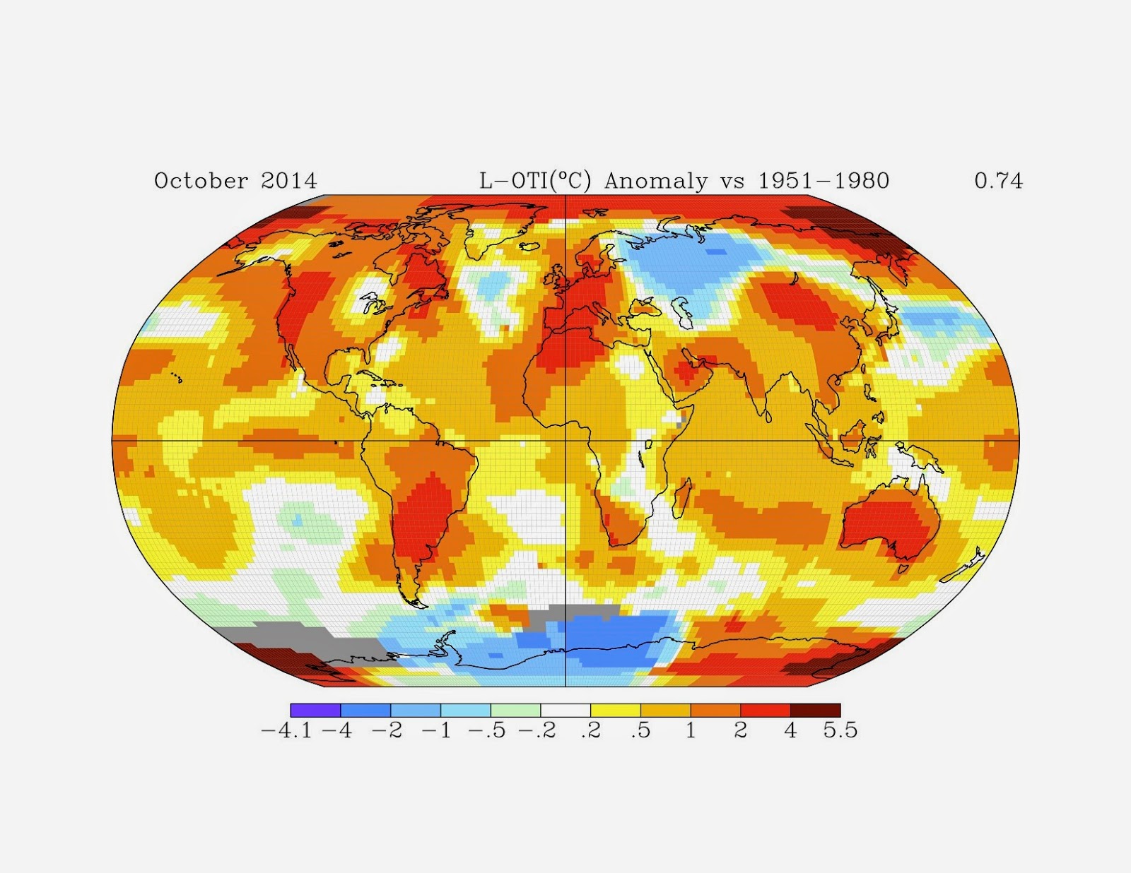
Hottest first six months on record

Image
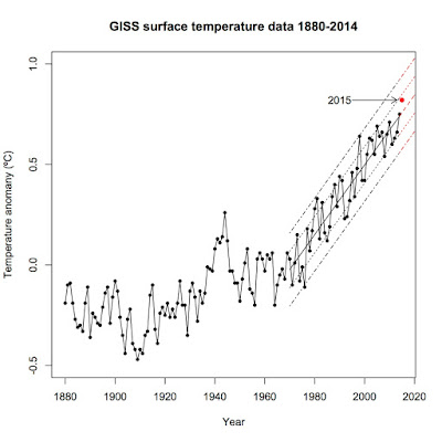
I know, I know, I'm behind a bit.  Most of the stories on the first six months of this year came nearly a month ago.  Better late than never.  By now, we all know that the world is headed toward its hottest year ever, breaking the record set just last year.  In this post, I'm going to analyze just how abnormal normal the first half of the year has been.

What Christopher Booker wants you to ignore.

Image
Christopher Booker wrote a highly deceptive piece in The Telegraph on temperature adjustments in Paraguay and elsewhere around the world.  His implication is that scientists have fraudulently adjusted temperature records to show warming when there really is none.

2014, NASA, and David Rose

Image
An old friend sent David Rose's article in the Daily Mail claiming that NASA is only 38% sure that 2014 was the hottest year on record due to the margin of error.  Unfortunately, while Rose has his facts largely correct, he jumps to the entirely wrong conclusion.

2014 among the hottest years on record.

Image
This is an update to my previous post on this topic, which was based largely on January-November data.  The full-year data is rolling out and no matter who is measuring, 2014 was a hot year for the Earth.

What is the deal with RSS?

Image
It's nice when a topic for a new post lands in your lap.  Or, in this case, in the comments of one of your old posts.  An anonymous commentator made several statements concerning RSS that warrant a longer explanation than is possible in a reply on the comment section.  This is going to be a long, stats-heavy post.  You've been warned.

Hottest years-to-date on record

Image
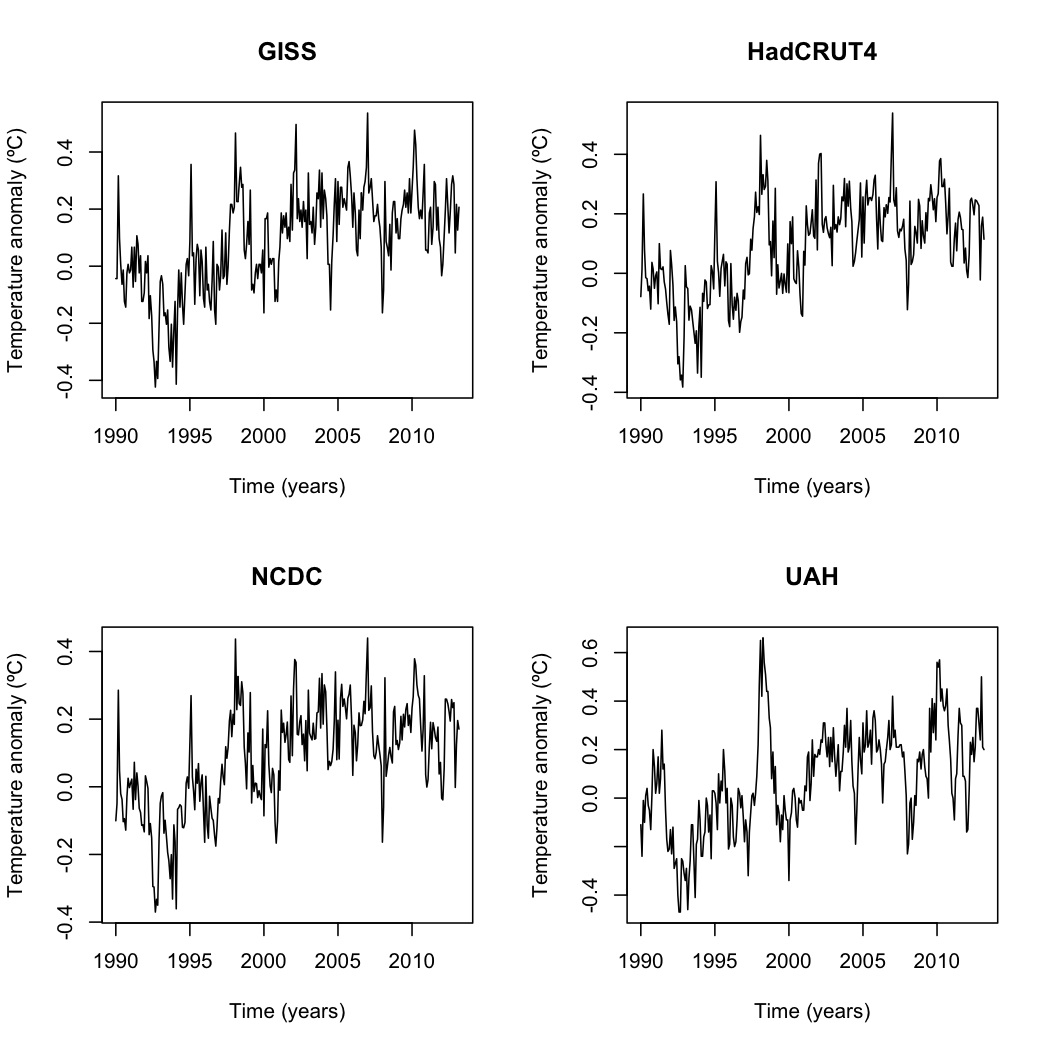
Back in August, I wrote a post that found the January-June period was the third hottest on record ( based on the Cowtan-Way data set which corrects the coverage bias in HadCRUT4 data).  This post will revise and update that earlier article, incorporating GISS, UAH, NCDC, HadCRUT4, and Cowtan-Way data sets.  I am not including RSS, as that data set has shown false cooling since 2000.

WUWT and how NOT to test the relationship between CO2 and temperature

Image
WUWT published a piece by Danle Wolfe which purports to measure the correlation between CO 2 and global temperature.  As you can probably predict, Wolfe's conclusion is that there is no relationship. "Focusing on the most recent hiatus below, both visually and in a 1 st order linear regression analysis there clearly is effectively zero correlation between CO 2 levels and global mean temperature."  Unfortunately for Wolfe, all he's produced is a fine example of mathturbation as well as an example of forming a conclusion first then warping the evidence to fit.

The last time the Earth had a 15-year cooling trend of any kind...

Image
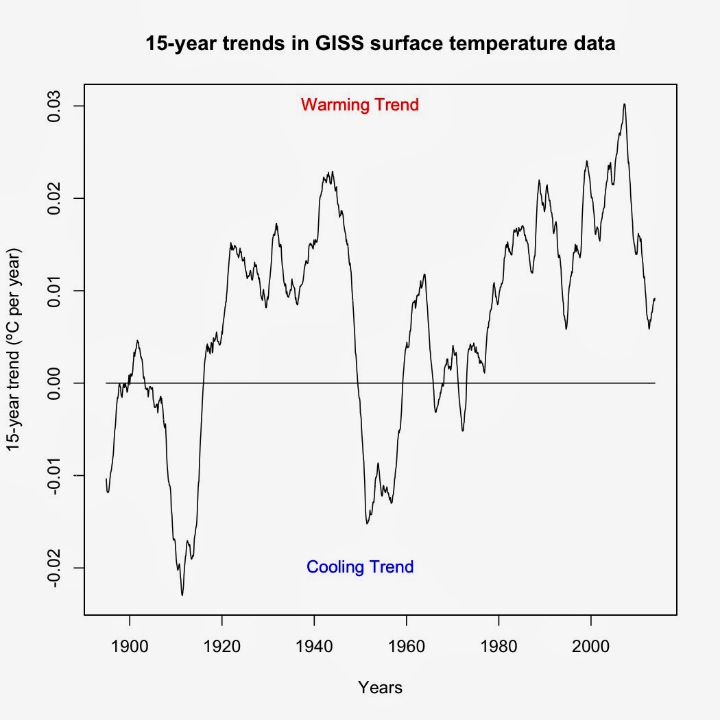
I was asked by a friend to identify the last time the Earth experienced a 15-year cooling trend.  The way I answered this was to use a rolling regression on GISS surface data (R code at the bottom).  Turns out that the last time was before I was born.  The period from February 1958-January 1973 (cooling of -0.00188ºC per decade) was the last 15-year cooling trend in GISS surface data.  Every 15-year period since has shown a warming trend of some magnitude—and yes, that even includes trends starting in 1998.   Figure 1.  Graph of temperature trends over each 15-year period.  Each point represents the trend over the preceding 15-year period. Now as to the last time the Earth showed a statistically significant 15-year cooling trend, well, that's a bit tougher to answer.  The code I'm using cannot account for autocorrelation, which means that it is biased toward showing significant time series trends when in reality the trends are not signific...

IPCC models versus actual temperatures

Image
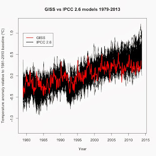
One of the dominant memes among climate deniers are that climate models are inaccurate.  While true, particularly since 1998 (see Fyfe et al. 2013 ), that fact doesn't mean that global warming isn't happening or that global warming is due to a natural cycle and not CO 2 as many deniers claim.  For those leaps of logic to be true, the entire field of radiative physics, 152 years of experiments, and 40+ years of satellite observations would all have to be wrong.  Nor does it mean that climate isn't as sensitive to changes in radiative forcing as multiple studies have shown it to be (i.e. Paleosens 2013 ).  What it means is far more complex. To illustrate this complexity, I compared IPCC AR5 climate models with surface temperatures (GISS).  The AR5 models were run with four scenarios, labeled RCP 2.6, RCP 4.5, RCP 6.0, and RCP 8.5.  Data for each scenario, along with global temperature data, AMO, PDO, etc. are available at Climate Explorer .  The RCP s...
Rates of change

Image
One common misunderstanding about how the current global warming differs from past episodes of warming is the rate of warming.  In this post, I'll show how the rate over the past 30 years stacks up with two of the better-known rates from geologic history. Past 30 years (1983-2013) rate ± standard error: UAH: +0.015379 ± 0.003783ºC per year GISS: +0.015505 ± 0.002491ºC per year NCDC: +0.014454 ± 0.002489ºC per year HadCRUT4: +0.014896 ± 0.002824ºC per year Depending on the data set, the rate of the last 30 years ranges from 0.014454ºC per year up to 0.015505ºC per year.  When I average the four data sets together then calculate the rate, the result is +0.014692 ± 0.003070ºC per year for the last 30 years. For the geologic rates, let's start with the most recent and work backwards in time. Over the 5,000 years since the end of the Holocene Climatic Optimum, the Earth slowly cooled by 0.7ºC ( Marcott et al. 2013 ).  That's an average rate of  -0.00014ºC...

Revisiting the question of "Has global warming stopped since 1998?"—again.

Image
Let me be blunt: There is little evidence that global warming stopped in 1998 or any year thereafter.  Most of the evidence we have, from the energy imbalance to total heat content to ocean heat content, show that global warming continues, as I previously explained here , here , and here .  The only piece of evidence that appears to show that global warming has stopped is that the trend in surface temperature data is not statistically significant in recent years.  However, that is at best ambiguous.  No significant trend could mean that warming continues but short-term variation in the data masks the trend, that there's no warming or that there's a cooling trend but not enough data for that to be significant.  There's no real way to tell unless you either a) add enough data for short-term variation to cancel out or b) use statistical techniques to factor out the known natural variation. In this article, I expand on my previous analyses of surface temperature, ...

Compensating for autocorrelation in global temperature data

Image
Autocorrelation in global temperature data simply means that the average temperature for any one month is correlated with the average temperature of the previous month.  It is an unfortunately common problem when dealing with time series and spatial statistics.  The gist of the issue is that most of the standard statistical analysis techniques such as ANOVA, regression, and the like assume that variation in the data is random or white noise when calculating standard errors and p-values.  Autocorrelation means that the noise in the data is not random but correlated or red noise.  The degree of correlation reduces the effective size of the data set and means that the standard errors and p-values calculated from normal statistical tests will be lower than they should be and biased toward showing statistical significance when in reality the tests should not show significance. One of the best ways to compensate for autocorrelation is to use an Autoregressive Integrated ...

Climate versus weather

Image
One of the main issues I encounter when I talk about global warming is people are confused about the distinction between climate and weather.  The two are related but fundamentally different phenomenon.

Meta-analysis

Image
A meta-analysis is a technique that combines data from multiple sources into one large dataset for statistical analysis.  This overcomes one of the main problems with many studies, which is sample size.  It's difficult and expensive in many fields to get a sufficiently large sample.  Doing a meta-analysis on data from multiple studies is a powerful way to get around that limitation.

Shifting bell curves

Image
One of the signatures of global warming is a shift in the frequency of global temperatures toward warmer temperatures.  One great way to visualize this shift in frequency is to plot out the densities of temperatures over several time periods.  For example, here is the density of global temperatures from 1880-1889, 1950-1959, and June 2003-May 2013:

An example of misusing statistics.

A couple days ago, a fellow user on a different forum challenged me with the following information while disputing whether or not the Earth is still warming:

One of the first questions...

Image
First, an introduction.  This blog will cover topics in ecology and environmental science.  That is, after all, my background.  I hold Bachelor's and Master's degrees in Biology, with emphasis on ecology, and am completing a Ph.D. in Environmental Science.  My research focus covers forest ecology but my training runs the gamut from calculating the spread and fate of pollutants in groundwater to creating watershed models to population ecology to ecosystem cycles.  My teaching experience is on the college level, having taught courses ranging from general biology to physiology to ecology, environmental science, and evolution. One of the first questions I'm usually asked when people find out my background is "Is global warming real?"  My answer is "Yes, it's real–and it's caused by humans."  In this post, I'll explore the data that shows that the Earth is warming.  I'll get into the data why we're the cause in subsequent posts.